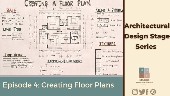
Welcome to the launch of a new series called the Architectural Working Drawing Series. This series is designed to cover architectural working drawing. This type of drawing is done after we have fully developed a design. Working drawings have loads of information which help in turning a design into reality. They give detailed information about every aspect of a drawing from the dimensions, to the material to be used, and how it can be constructed.
Throughout the course of the series, we will be discussing all the components that go into architectural working drawing. Hence, the following is a list of upcoming episodes under this series:
Understanding Working Drawings
Site Plan Working Drawings
Floor Plan Working Drawings
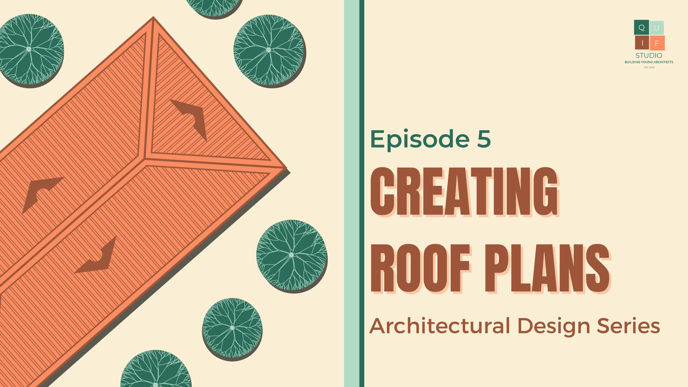
Roof Plan Working Drawings
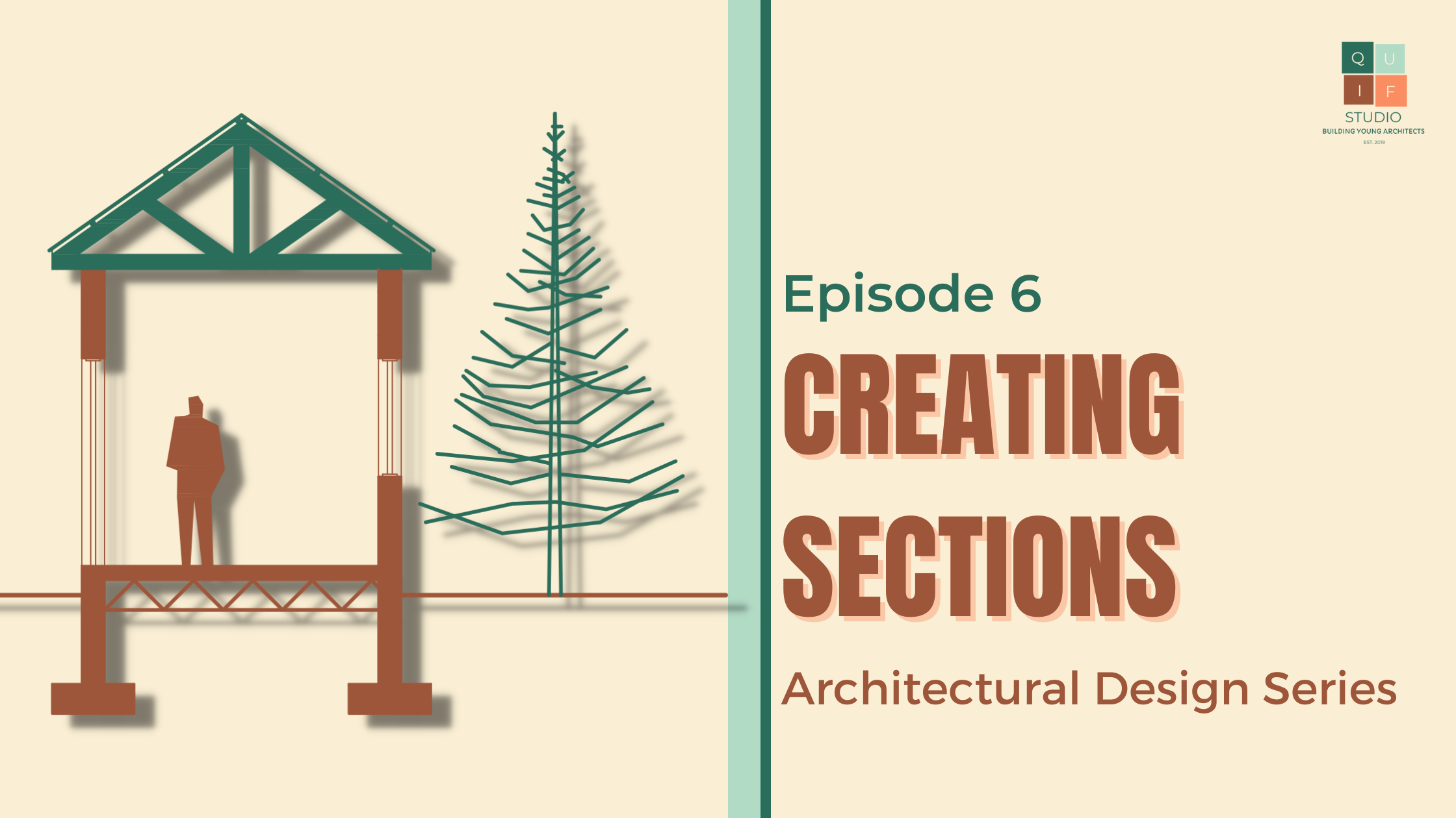
Section Working Drawings
Elevation Working Drawings
Detailing
Schedules and Specification Writing
Stay tuned for this series and comment down below what your expectations are. If you are a student, have you ever done working drawings? What do you like about it or what part challenges you the most?
I would really appreciate your feedback. You can also email me with any suggestions from the Contact page.
Perspective drawings are drawings in 3 dimensional views that are used to create realistic views of a building or an object. Perspective drawings help us show more than one view at once, for example, we can see two elevational drawings at once from a perspective drawing.
Perspective drawings have many types and forms, but there are 3 common types of perspective drawings. These are One-point Perspective, Two-point Perspective and Three-point Perspective. Along the journey of your training in architecture school, you will be required to draw all the three types.
Before we jump into explaining the types of perspectives, let us first go over basic terms and principles that you need to understand before drawing a perspective.
Terms and Principles of Perspective drawings
We understand that a perspective drawing is a 3-dimensional (3D) drawing represented in 2-dimensional (2D) form. We come across perspectives in our everyday activities. From the images we can see in our phones, cameras, laptops to our sketchpads, drawing paper or canvas we are able to perceive 3D objects from flat surfaces. Those flat surfaces can be treated as an imaginary plane from where the object might have been viewed in real life. We call that plane the Picture Plane (PP).
Since we use our eyes to view objects, in drawings, a single eye is used as the primary reference for all the lines in a perspective drawing. The location/position of the eye can determine so much about how we perceive an object. This location/position is referred to as the Station Point (SP).
The station point can have a height from the Ground Plane (GP) which in simpler terms can be described as the floor or surface a spectator is standing on. This is the height or level from where a person is viewing an object.
This height can open up to 3 different angles of view. We have a normal eye level view which is the spectator viewing directly in front of him/her. There is a high angle of view which is referred to as worm eye view. This means the spectator is tilting his/her head up to view an object. Lastly, there is a low angle of view which is referred to as aerial view. This means the spectator is tilting his/her head down to look at an object.
3 Level of Views (Source: Design Drawing by Francis D. K. Ching)
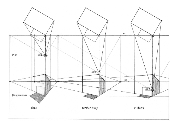
The distance of the spectator or the SP from the object can also have an effect on the drawing. Imagine holding a box in your hand along your eyesight level. The closer the box gets to your eyes, the less you can see. If the box is an arm’s length from your eyes, you will perceive the view of the box better. If the SP is close to an object, the more compressed the drawing becomes. If the SP is further away from an object, the view of the object become wider.
Effect of SP Distance (Source: Design Drawing by Francis D. K. Ching)
When we view a vast open land, there is always that point where the ground and the sky meet, which is referred to as a horizon. That doesn’t mean that the ground or sky stop there, but it is as far as our eyes can see. It usually forms a line that runs across horizontally. In drawing perspectives, that line is referred to as the Horizon Line (HL). The horizon line is usually imaginary; however, it is a vital part of perspective drawings. Whether we are viewing a beautiful landscape or a building, there is always a horizon line.
Horizon lines are usually used to position Vanishing Points (VP). In perspective view, parallel lines are perceived to converge/move towards a common point. As these lines move towards the point, the appear to disappear or vanish. That point is referred to as a vanishing point. Vanishing points are used as reference points to help guide the projection of parallel lines.
Vanishing Points
A drawing can have more than one vanishing point. The number of vanishing points gives rise to the 3 common types of perspective drawings earlier mentioned. Let’s describe them below.
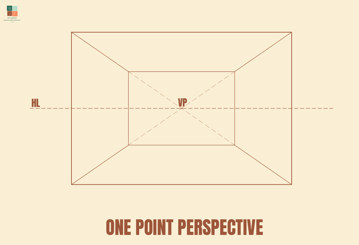
One point Perspective
From the name, this perspective has one vanishing point, which is sometimes centralized. This is best used to draw interior perspective views or drawings that have a central focal point.
One-point Perspective
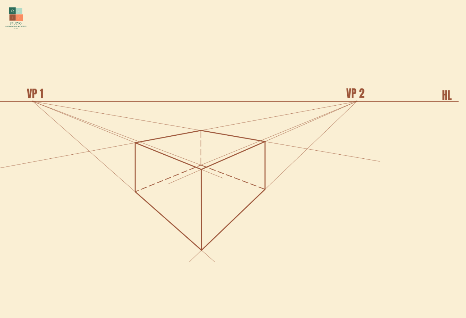
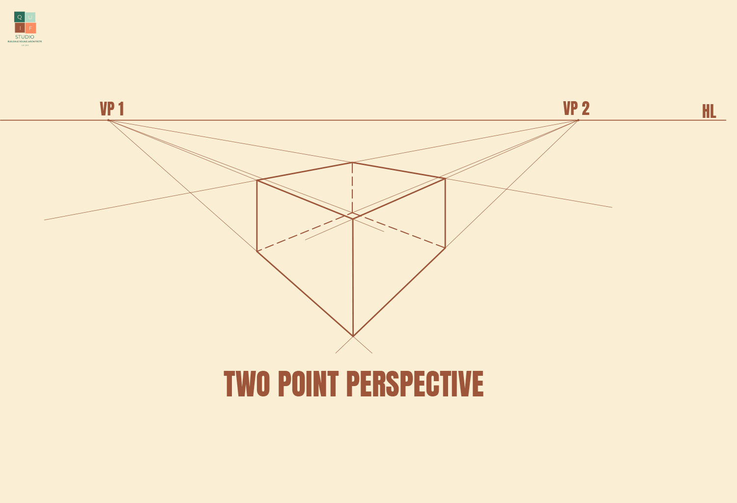
Two-point Perspective
This perspective type has two vanishing points. The closer the vanishing points, the more compressed the drawing is. The further away the vanishing points are from each other, the better the view of the object. Sometimes vanishing points might not fit onto your drawing sheet, which is okay since they are just reference points.
Two-point Perspective
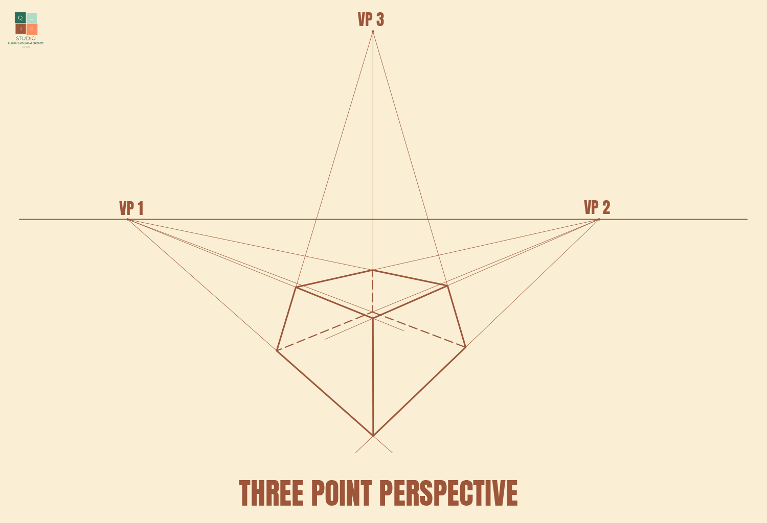
Three-point perspective
This perspective type has three vanishing points. This gives more detail to how objects are perceived in reality. The more vanishing points a drawing might have, the more complex and more detailed the drawing is.
Three-point Perspective
Perspective drawing can be very tricky for a beginner, so for the purpose of this post, we will be using a small rectangular building to draw a two-point perspective.
Rectangular Building Design
Generating a perspective
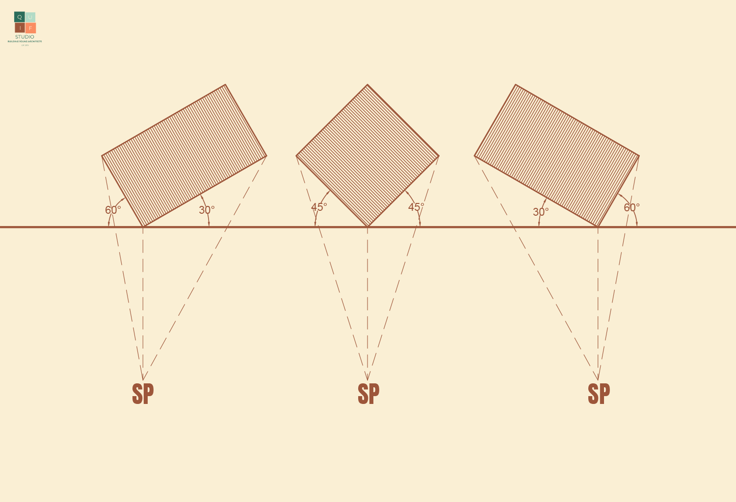
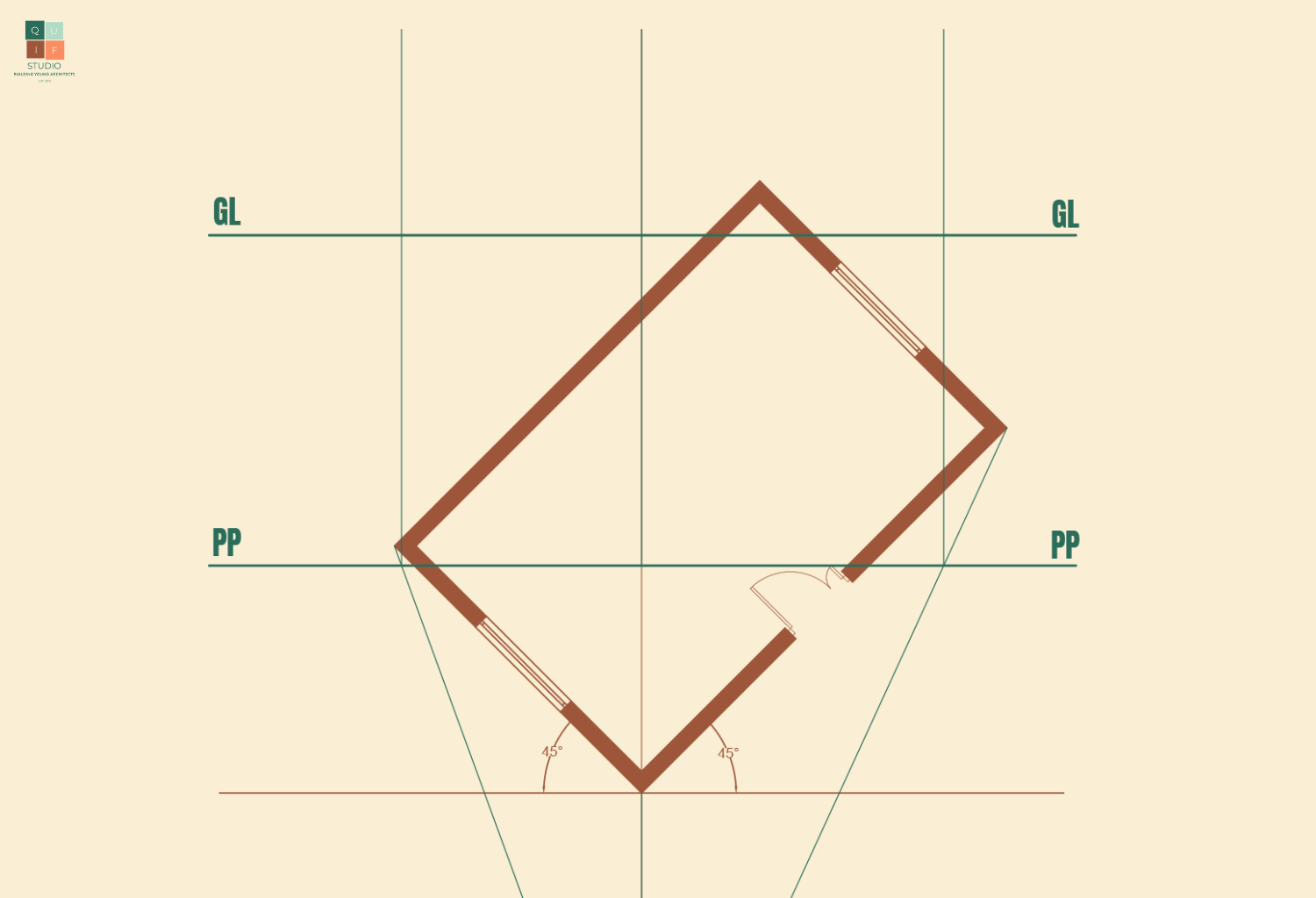
The first step in drawing a perspective from a floor plan is to orient the building to a desired angle of view. The angle we choose will have an effect on how the drawing comes out.
Angle of View
From the diagram above, the second option will reveal both sides of the building evenly for a more pleasant perspective drawing/image. Therefore, we will adopt that angle of view.
Angle of View for the Building
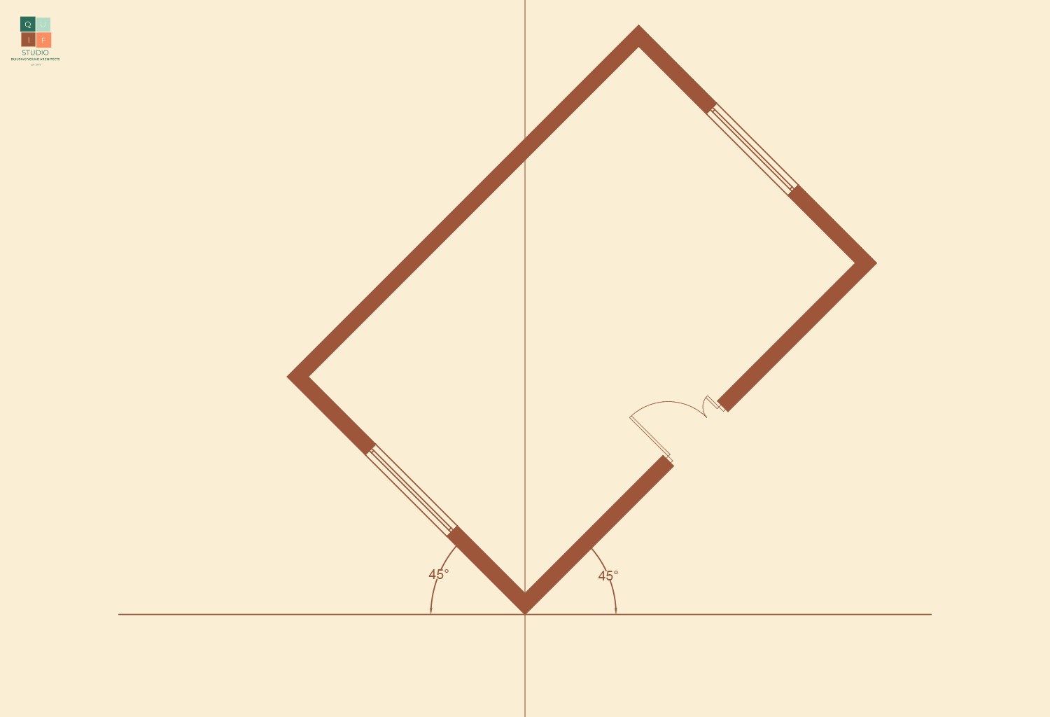
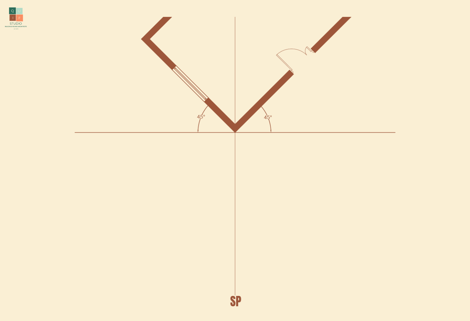
We will now place the station point. We will give adequate length away from the building to avoid compressing the perspective image.
Position of Station Point
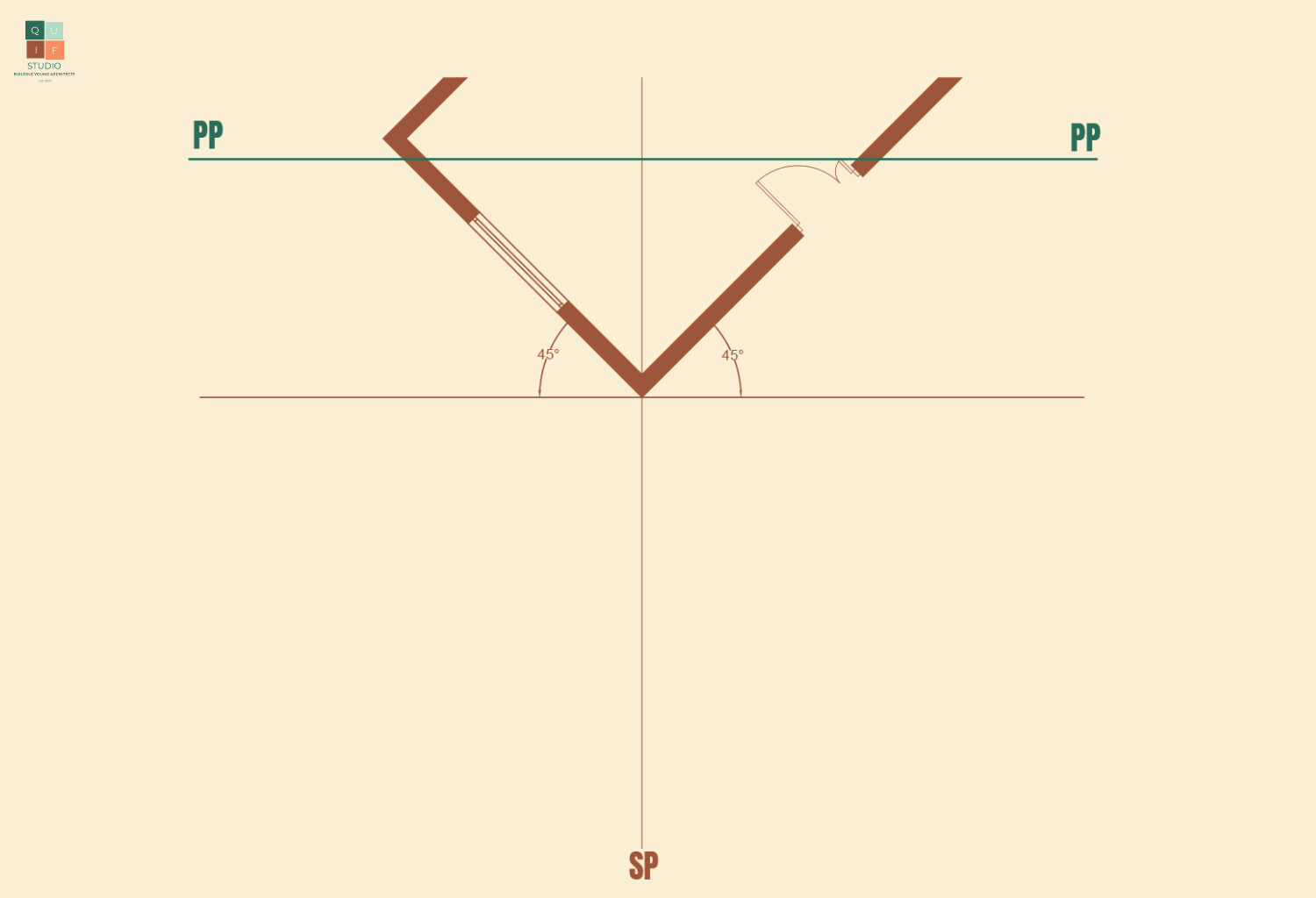
We can now choose the position of the picture plane. This will affect the overall size of the perspective image. The closer it is to the station point, the smaller the image. The further it is to the station point, the larger the image. We are going to place the plane not too far away from the station point for a moderate sized image.
Position of Picture Plane
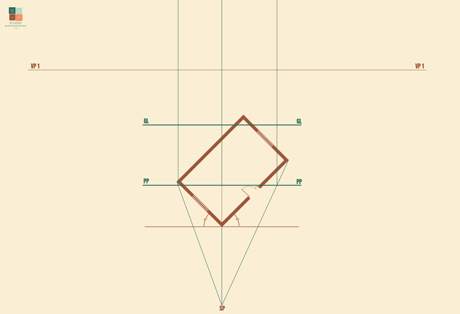
Next, we project lines from the station point to touch the edges of the buildings. These lines should extend and land on the picture plane.
Projection of lines from Station Point to Picture Plane
We can now project lines perpendicular to the picture plane from each point where the first projection lines touched the picture plane. We can also introduce a ground line to indicate where the perspective image begins.
Projection of lines from Picture Plane to Ground Level
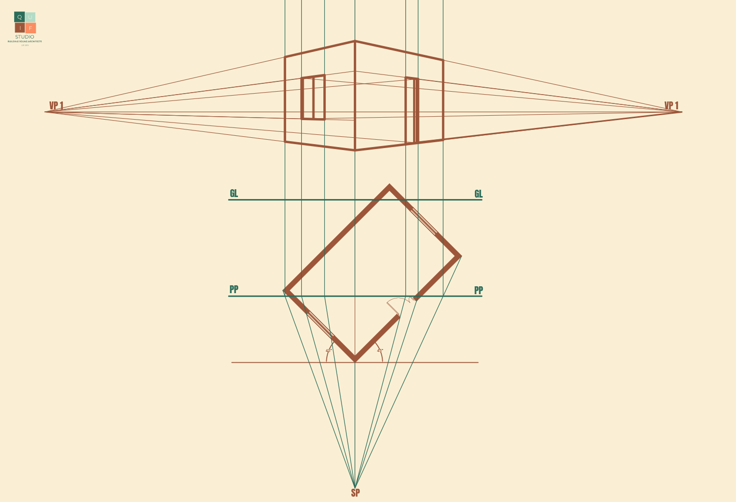
Next, we add in the horizon line and introduce the two vanishing points.
Horizon Lines and Vanishing Points
Now, we specify the height of the building along the centre line of view. This will just be a rough estimate. We can then proceed to project lines towards the vanishing points.
Estimated Building Height
We can begin to generate the perspective image. We are going to identify the connectivity of the walls and add line weight to them.
Outline of Building
Now add the doors and windows using the same projection style.
Adding Doors and Windows
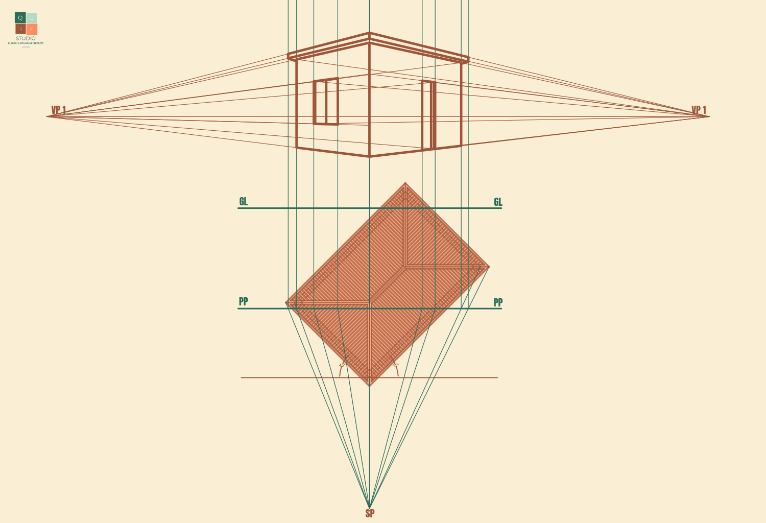
Next, we can project the edges of the roof. To do that, we will need to align the roof plan with the tilted floor plan.
Adding Edges of Roof
For the roof, we can use the plan to identify where the roof lines will be through projection. However, hip roofs generally have a different vanishing point from the building. This is because lines of roof do not run in a perpendicular or parallel manner, they slope towards various directions.
We will introduce another vanishing point perpendicular to the horizon line, but on the same axis with VP 1. We will use that vanishing point to project the left corner of the roof. The ridge line will project to VP 1 since it has the same properties as the walls (they run on the same axis). We can now connect the other lines of the roof to complete it.
Projection of Roof
Finally, we can add in finishing details, such as textures, shading, landscaping etc.
Adding Details to the drawing
As earlier mentioned, drawing perspectives can be tricky. They require constant practice. You can find many tutorials online about how to draw perspectives.
This is the last post in the Architectural Design Series. I hope you learnt the basics of architectural drawings. Feel free to comment and ask questions. Thank you for reading!
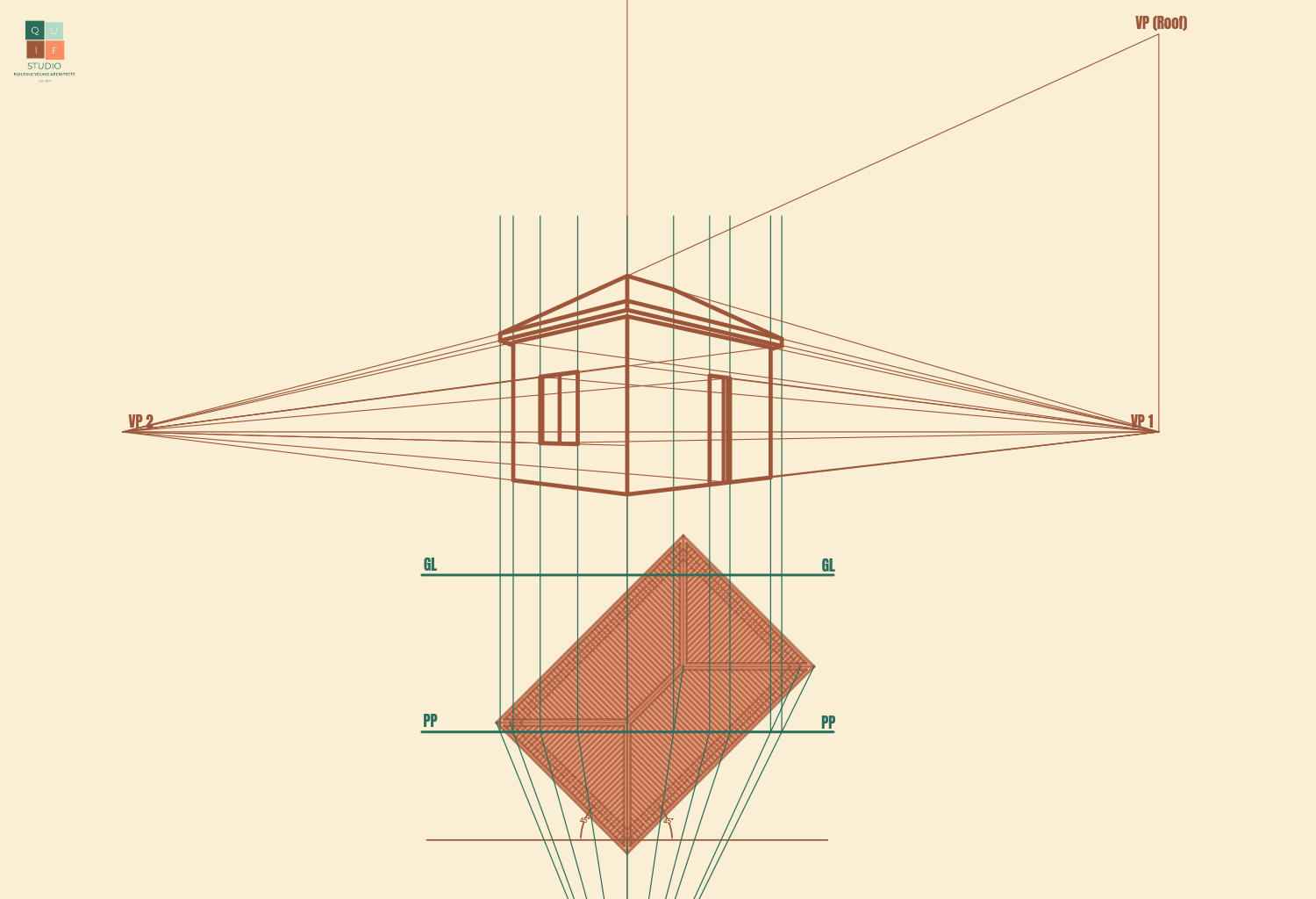
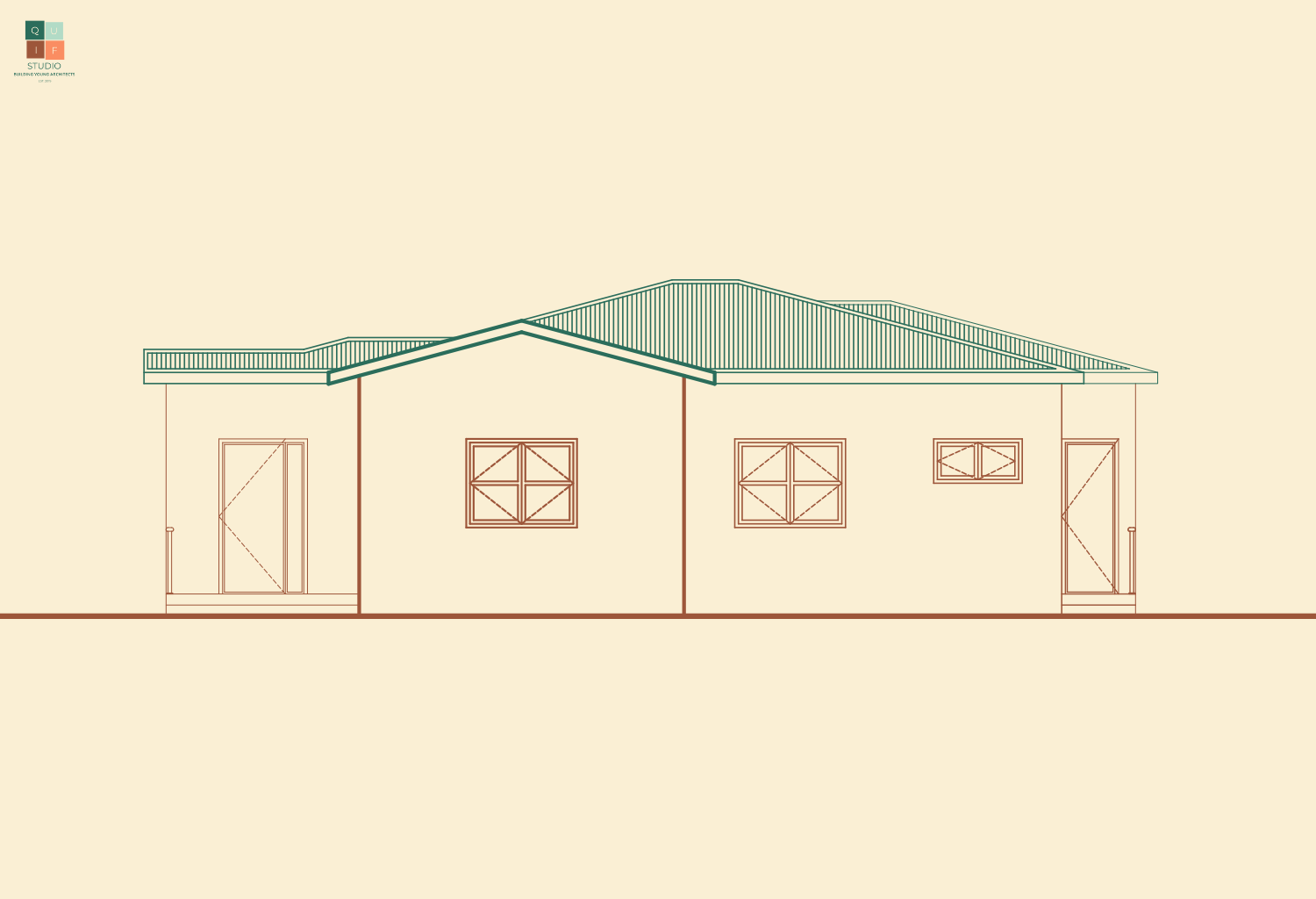
Elevations are side views of a building or an object. Elevations can either be exterior, which show the exterior sides of the building, or interior, which show an interior view of a building. Elevations usually show exterior views of windows, doors, walls, roofs, landscaping, human figures and various elements that help bring the design to life.
Elevations also give us the opportunity to show the façade and other aesthetical features of the building. Sometimes, certain features or finishes are added to the exterior part of a building for the sole purpose of beautifying it.
For the design that we have been working on from the beginning of this series, let’s generate the elevations.
Generating an Elevation
In drawing the front elevation, we can use the same method used in drawing sections. We can simply project the lines to give us a perfect outline of the view. We are not going to repeat the step-by-step process, however you can read about how to project sectional views here.
The front elevation will look something like this:
Outline of Front Elevation
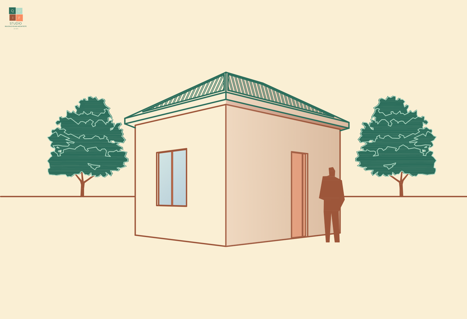
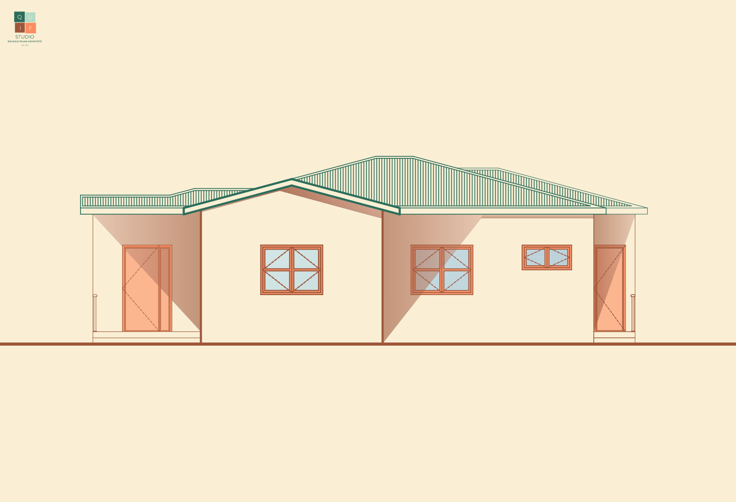
Now that we have the view, we can begin to add various elements to the design. Let’s start by adding some line weight. The objects at the front, which are presumed to be closer to the point of view, will be thicker than objects which are behind (presumed to be further away).
Adding Line weight
We can now add some shades and shadows to create depth in the drawing.
Adding Shadows
Let us add some detail to our doors and windows.
Windows and Doors Detail
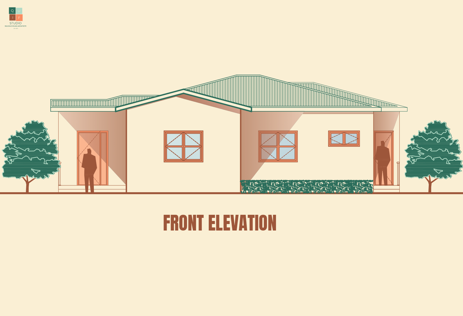
Lastly, we can add in some landscaping and human figures to tie it together. The final outcome of the front elevation will look like this:
Front Elevation
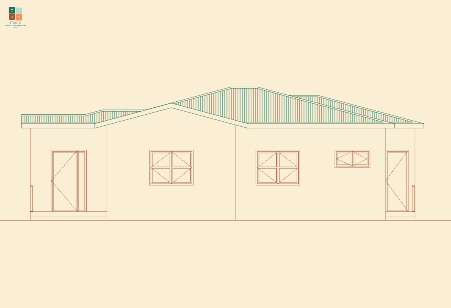
Using the above steps, we can produce the elevations for all the sides of the building.
Elevation Graphics
To draw an elevation, there are certain graphical and design elements you need to consider.
1. Scale
The scale used in drawing an elevation should be the same as previous drawings. This will give uniformity in the presentations of the drawings. Therefore, we will stick to scale 1:100. For larger drawings, the scale moves to 1:200. To show more details, we use scale 1:50 (scale is in millimeters).
2. Lines
As previously explained, thick lines are used to represent objects closer to a point of view, while thin lines represent objects further away.
All lines are drawn using continuous lines except any hidden objects which are drawn with short dashes.
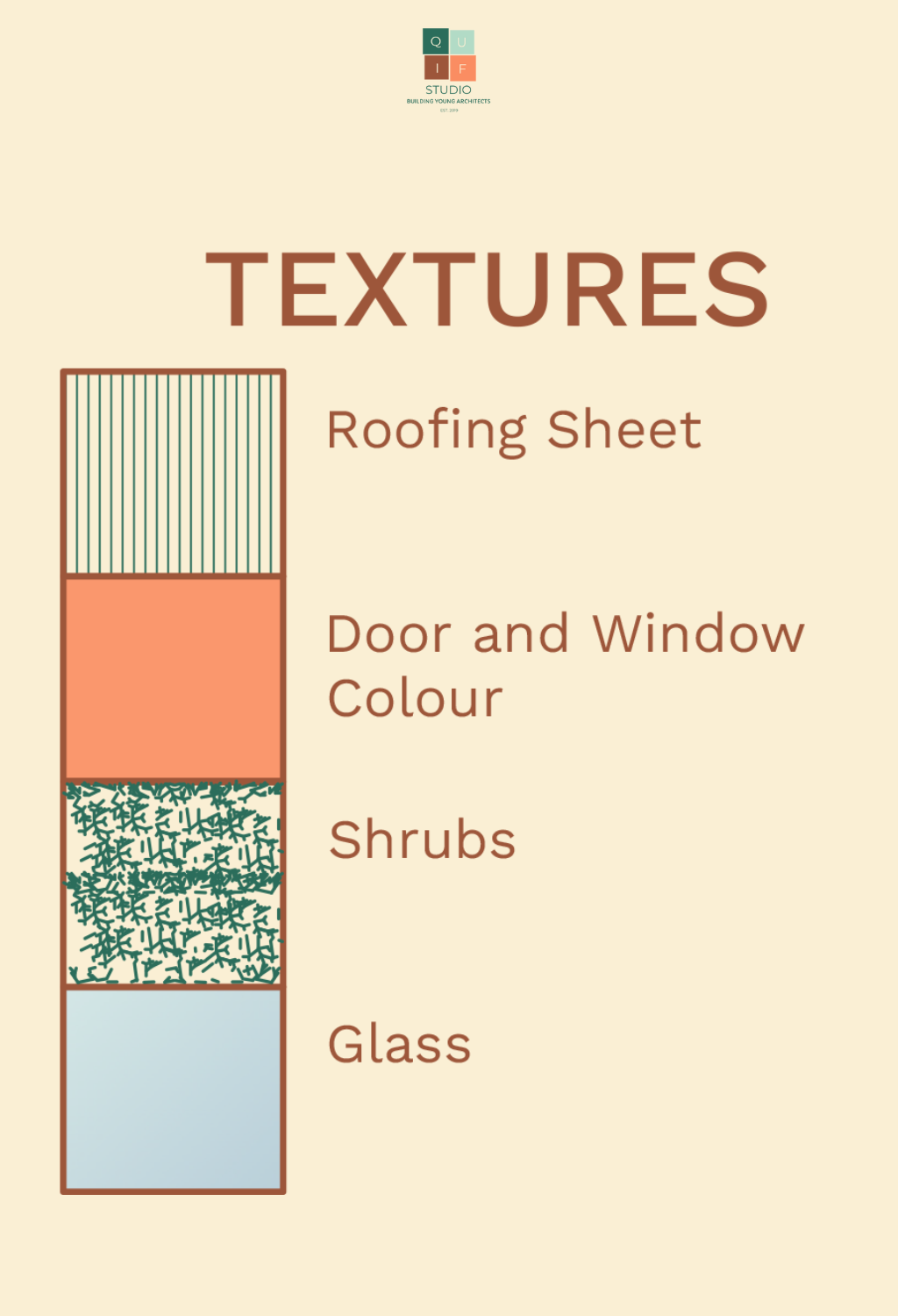
3. Textures
Here are some textures we adopt in drawing elevations:
Textures in Elevations
You can be as creative and expressive as you want when designing elevations. The façade of a building is its first impression. Next week’s post will be the last episode of the series. Thank you for reading and stay tuned!
A section is a scaled drawing of a building which has been cut or sliced along a plane which is identified in the floor and roof plans. This plane is called a section plane which is represented by a section line.
Earlier we described a floor plan as a horizontal section of a building which cuts through the walls and openings within a building. Building sections are cut vertically.
Types of Sections
They give us more detail about the drawing as they show the relationship between various parts of a building. They reveal how foundations, walls, floors, staircases and roofs are all connected to one another.
Selecting the position of section plane is crucial as they reveal important details for construction purposes. Ensure you choose points that give the most information about your design, for example, showing sections through stairs, openings, floor areas with different levels, spaces with different level and ceiling heights, roofs etc.
Now that we have floor and roof plans for our designs, we can select the section plane for the design. A minimum of two section drawings are required for designs; one along the horizontal axis and the other along the vertical axis of a plan. Here are the locations of the two section lines namely Section A-A and Section B-B.
Floor PlanRoof Plan
Before proceeding to generate a section, we first have to identify the various elements of our building. For the purpose of this post, I will stick with the common types of elements and materials used in small constructions in our environment.
For the foundation, we will use a raft foundation. The floors will be concrete floors of 150mm thickness. The walls will be concrete masonry blocks of 230mm thickness (9-inch blocks). Structural beams and columns will be of reinforced concrete. The roof will be made up of timber trusses and long span aluminum roofing sheet. The roof will have a slope of 15-degrees.
Generating a Section
Drawing a section can be very simple, yet complicating. If you do not have a decent understanding of building construction, it might give you a hard time. Nevertheless, we will try and proceed with this in the simplest way possible. Let’s start with Section A-A.
A simple trick I try to use when drawing sections is just to rotate the floor plan in the direction of the section line and just project all the lines for the section from the floor plan. This saves me time and prevents me from limiting the number of mistakes I might make when drawing it from scratch.
Projection of lines from Floor Plan
I can now indicate the levels and height of walls, floors and openings.
Levels and Heights in Section
I repeat the same steps above for the roof.
Roof Projection
Outline of Roof
Now that I have a rough outline for the section, I can begin to add in details of the section. Let’s start with the foundation. The foundation comprises of 6 levels. First, we have the foundation footing, followed by the foundation walls. We then reach the hardcore filling level. On top of that we have the wire mesh and damp-proof membrane. Finally, we have the concrete floor. Due to the scale of the drawing, some thin layers might not be visible like the damp-proof membrane and the wire mesh.
Foundation of Section
After the foundation, we have the walls, openings and any visible beam. We have beams at 2 major spots, one above openings referred to as lintel beams and the other where the roof sits on referred to as overhead course beam.
Walls, Openings and Fixtures of Section
Now we proceed to draw out the roof trusses. We already have the outline of the roof shape. To understand how to draw a section of a roof, you first have to know how roofs are constructed. Examine the images below of a roof carcass.
From the picture above, we can see that depending on where we cut a section, we might see various parts of it. This why I mentioned that the location of the section plane is very important. For this design, we cut through the highest point of the roof. Therefore, we will see a traditional king post truss design.
Roof of Section
The overall section will look like the image below.
Section A-A
Section B-B will look like the following:
Section B-B
Section Graphics
To draw a section, there are certain graphical and design elements you need to consider.
1. Scale
The scale used in drawing a section depends on the scale adopted for the floor plan and roof plan. In maintaining scale 1:100, the drawings will be of a uniform scale. For large buildings, the scale can move to 1:200, however, since sections reveal important details of a building, it will be better to use larger scales such as 1:50 or even 1:25 to show more detail (scale is in millimeters).
2. Line weight
There are a lot of line weights displayed in a section drawing. The walls, floors, beams roof trusses being directly sliced into have the thickest lines. Openings, ceilings, fixtures and other objects visible within the section are drawn in a medium thickness while floor finishing, wall finishes and dimensions are drawn with thin lines.
All lines are drawn using continuous lines except any hidden objects which are drawn with short dashes. Grid lines are thin chained lines.
3. Textures
Here are some textures we adopt in drawing sections:
Textures in Sections
4. Labelling and Dimensions
Labelling spaces, objects and materials/finishes are important part of sections. We can proceed to add grid lines and dimensions to the section as final touches.
It will definitely take some practice before you are able to nail section drawing. My advice will be pay attention in building construction classes. Next post talks about creating elevations. Stay tuned to read about it. Thank you for reading!
You are at a stage where you have a functional floor plan. The next step to take would be to create a roof. A roof is a building element that covers or forms the top of a building. There are various types of roofing designs. Here are 12 common roof designs.
12 Common Roof Types
For the purpose of this post, I will be using a combination of Gable and Hip roof type.
Elements of a Roof
Before creating a roof, we first need to understand what a roof is made up of.
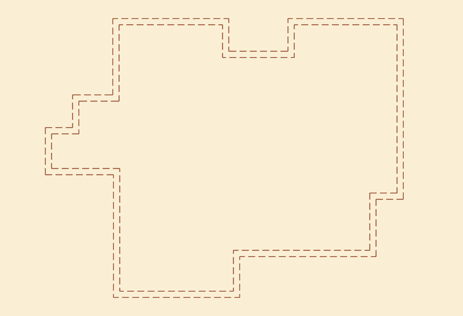
After selecting a suitable roof type for your design, the next step would be to sketch out the roof footprint/layout. Using the floor plan created in Episode 4: Creating Floor Plans, the footprint of the roof covers all the external walls . This is drawn using a broken line to indicate that it is a hidden detail.
Outline of Exterior Walls
At this point, we can identify the edge of the roof. This would also be the location for the roof fascia. For this design, we will use a width of 300mm from the external wall for the fascia.
Now we can draw out the plan of the roof. The gable part of the roof will be at the front and left side of the building, while the rest of the roof will be a hip design.
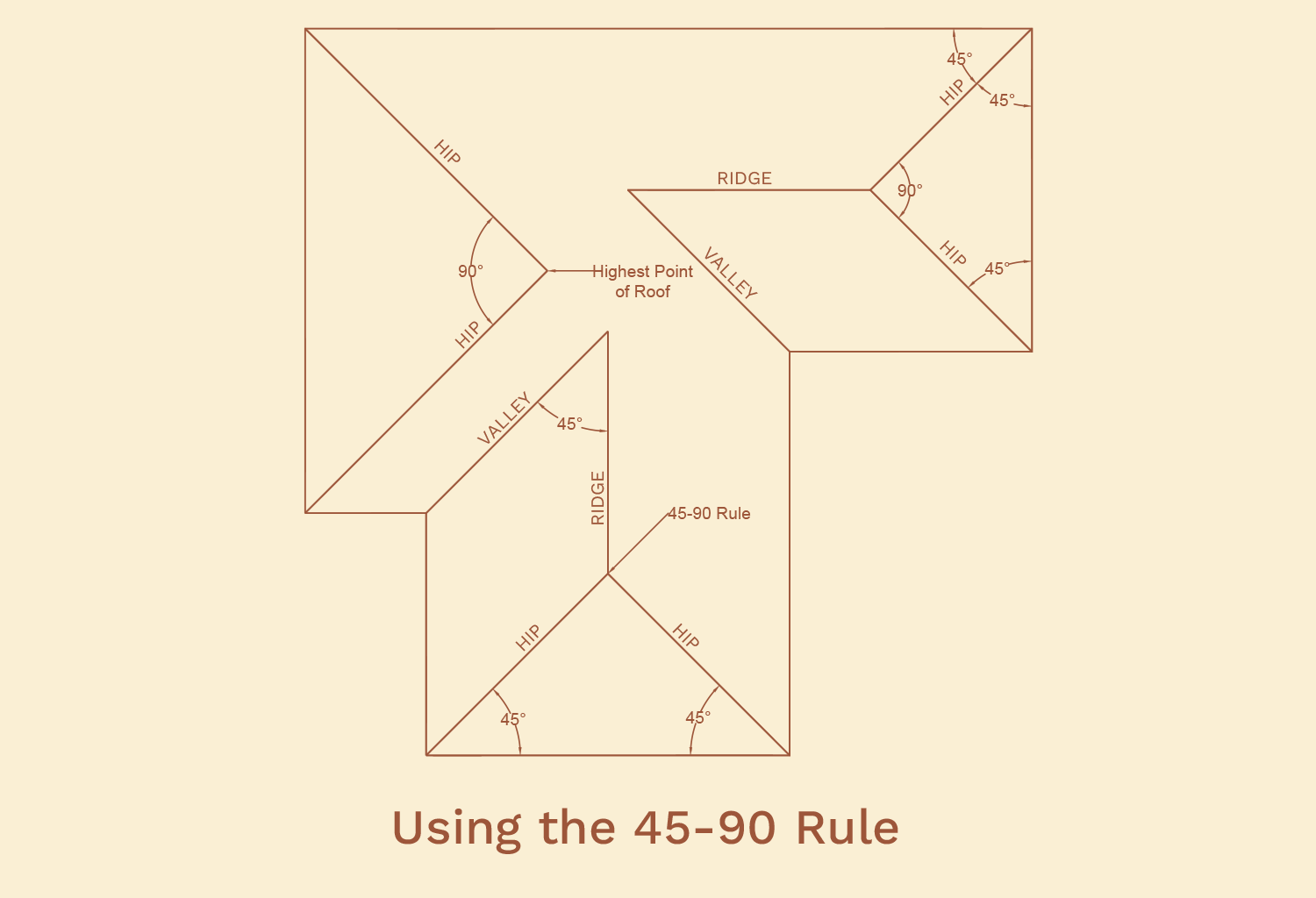
To draw these out, it is important to know a little rule I like to call the 45-90 rule. This rule helped me learn how to draw out the plan of a hip roof. The lines drawn to make a hip roof are usually projected at a 45-degree angle. We will refer to those lines as Hip lines. Where these two points meet creates a 90-degree angle or a right angle. At any point where a 90-degree angle is met, a straight line emerges from it. That straight line forms a ridge line. Examine the example below.
Example of Hip Roof Connection
For more complex roofs, like roofs that have valleys, the same concept is applied with a little twist. The valley lines are extended to connect with the ridge line in their path. At the point where they meet, a hip line is introduced. The direction of the hip line should be towards the highest point of the roof. This line will either connect with another hip line (coming at a 45-degree angle) to form a 90-degree angle to form another ridge line, or will join the highest point of the roof and complete it. Examine the example below:
Complex Hip Roof Connection 1Complex Hip Roof Connection 2
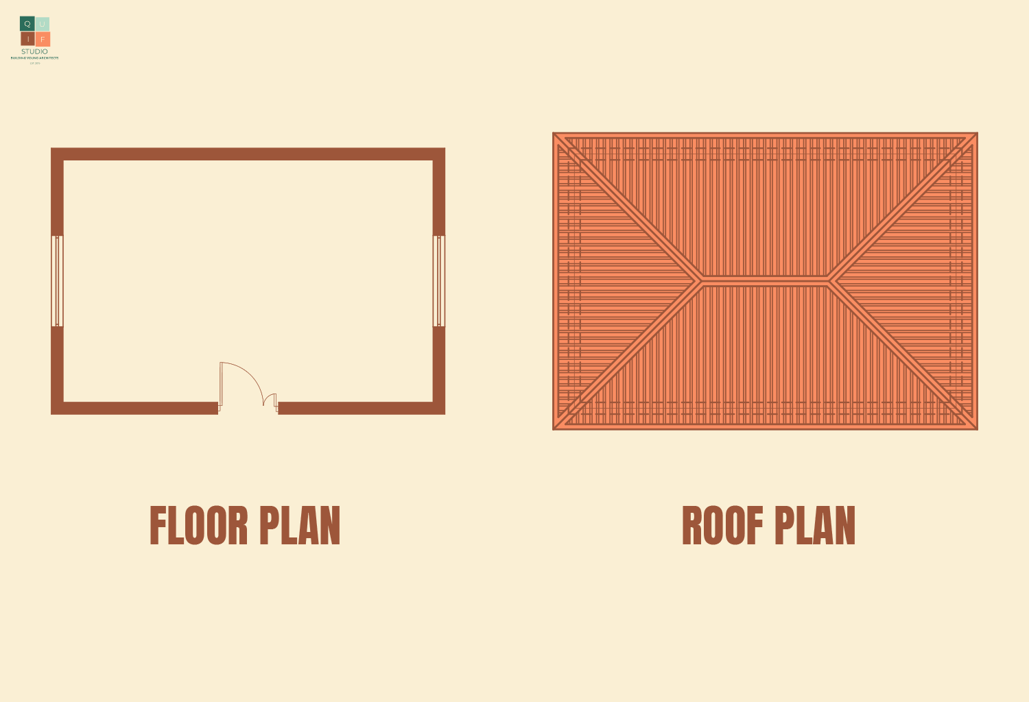
For this design, the plan for the roof will look like this:
Layout of Roof PlanRoof Plan
Roof Plan Graphics
To draw a roof plan, there are certain graphical and design elements you need to consider.
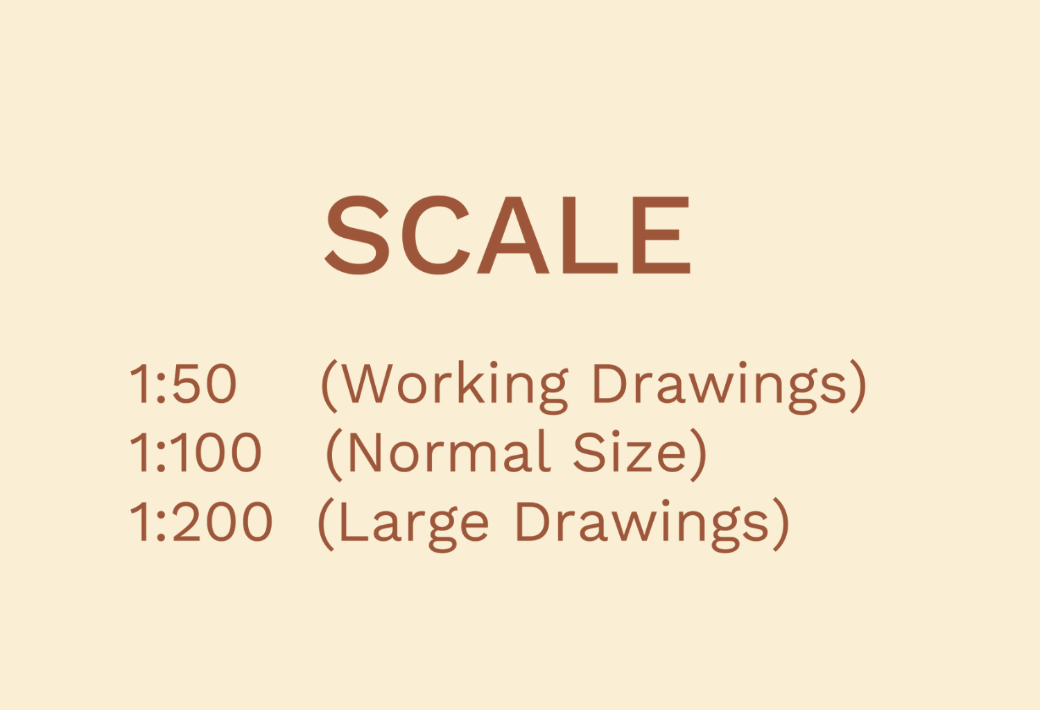
1. Scale
The scale used in drawing a roof plan should be the same as the scale of the floor plan. This will give uniformity in the presentations of the drawings. Therefore, we will stick to scale 1:100 to draw the roof plan. For larger roof plans, the scale moves to 1:200. To show more details on a roof plan, we use scale 1:50 (scale is in millimeters).
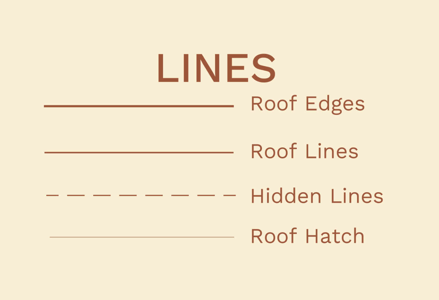
2. Lines
There are a lot of line weights displayed in a roof plan. The outline of the roof is usually the thickest. The roof lines (ridges, hip, and valley) follow with medium thickness. Hatches and other details are drawn with thin lines.
For the line types, the roof outline, roof lines and hatches are drawn using continuous lines, while hidden objects are drawn with short dashes.
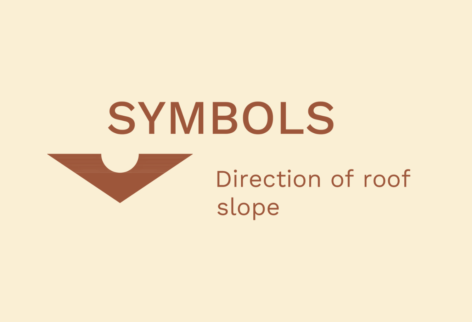
3. Signs and symbols
The main symbol used in a roof plan is used to show the direction of the slope of the roof.
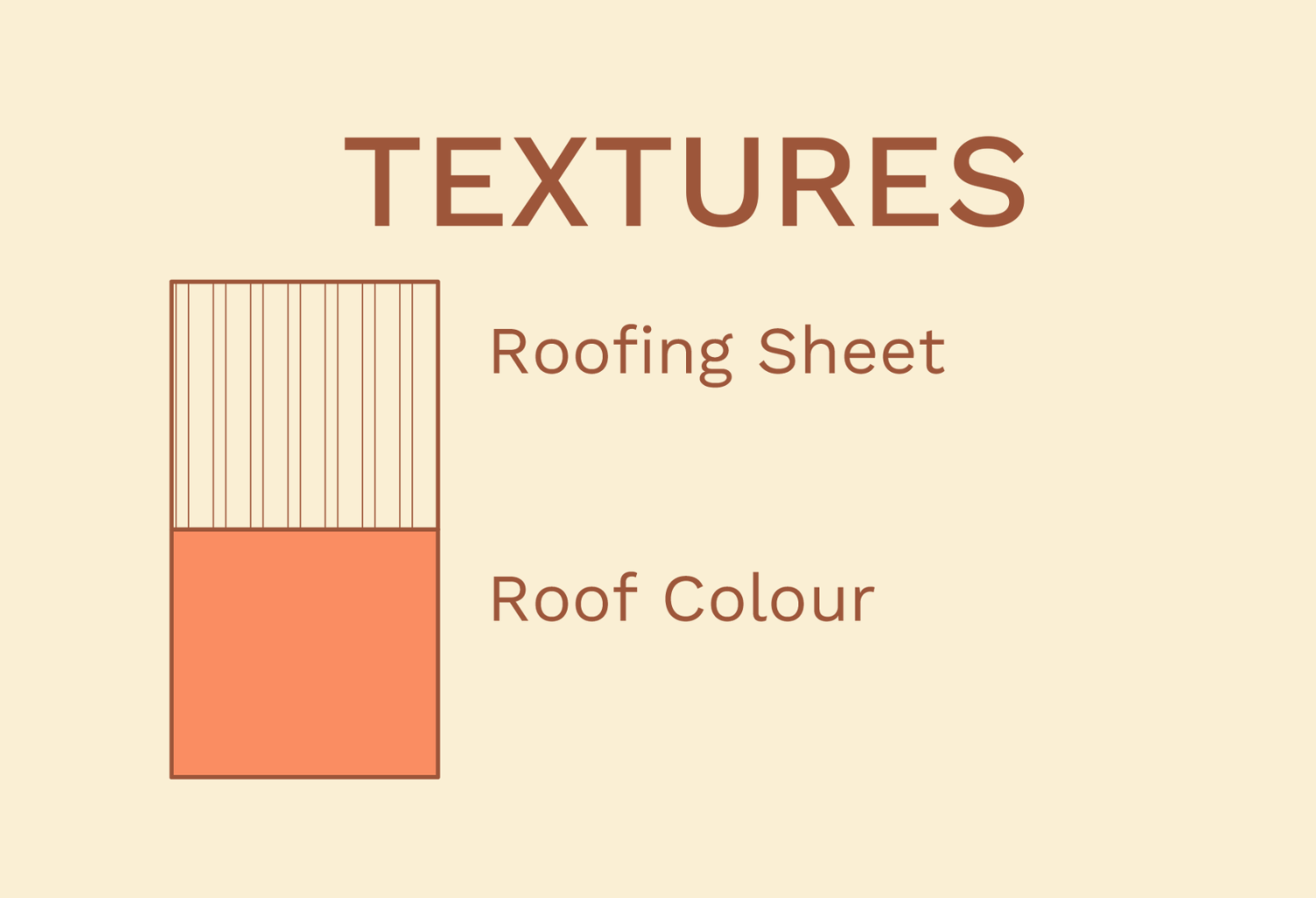
4. Textures
Here are some textures we adopt in designing roof plans:
Roof plans can be over looked during design, but they are vital for the next step in the series. Stay tuned to find out in the next post . Thank you for reading!
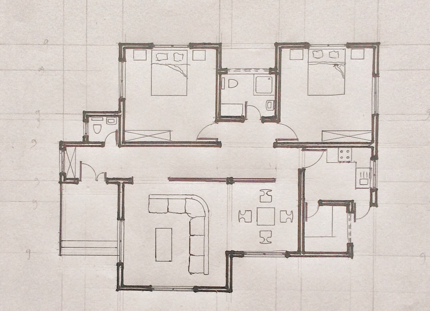
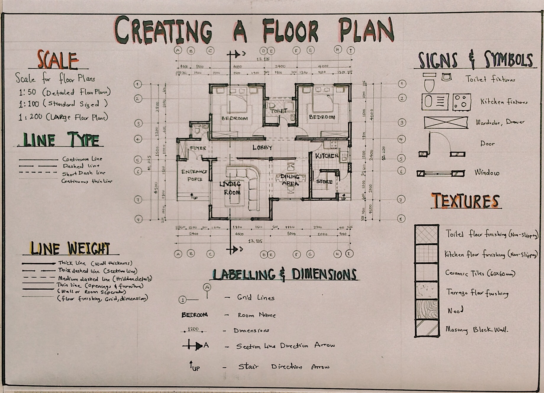
A floor plan is a scaled drawing of a building which shows the layout of spaces and how they interact. A floor plan can also be described as a horizontal section of a building, it cuts through the walls and openings within a building. Today we’re going to dive back into the Preliminary Design Stage to fully understand how floor plans are made. It isn’t just lines and rooms brought together; a lot of thought goes into the design of a floor plan.
Let’s start from Case Study and Literature Review. We have studied the proposed building type, conducted case studies, understood the brief and made decisions on the spaces/functions we want in our building.
We then selected the best possible site using a Site Selection Criteria and studied the surrounding environments using Site Maps.
Next, we did a Site Analysis. We have determined the micro and macro climate of the proposed site, the sun path, major wind directions, and have identified the best possible orientation strategies to be adopted by the building to optimize natural lighting and ventilation.
We then used Zoning to identify which spaces belong in which zone (noisy/quiet zones, private/public zones, accessible zones and secure zones)
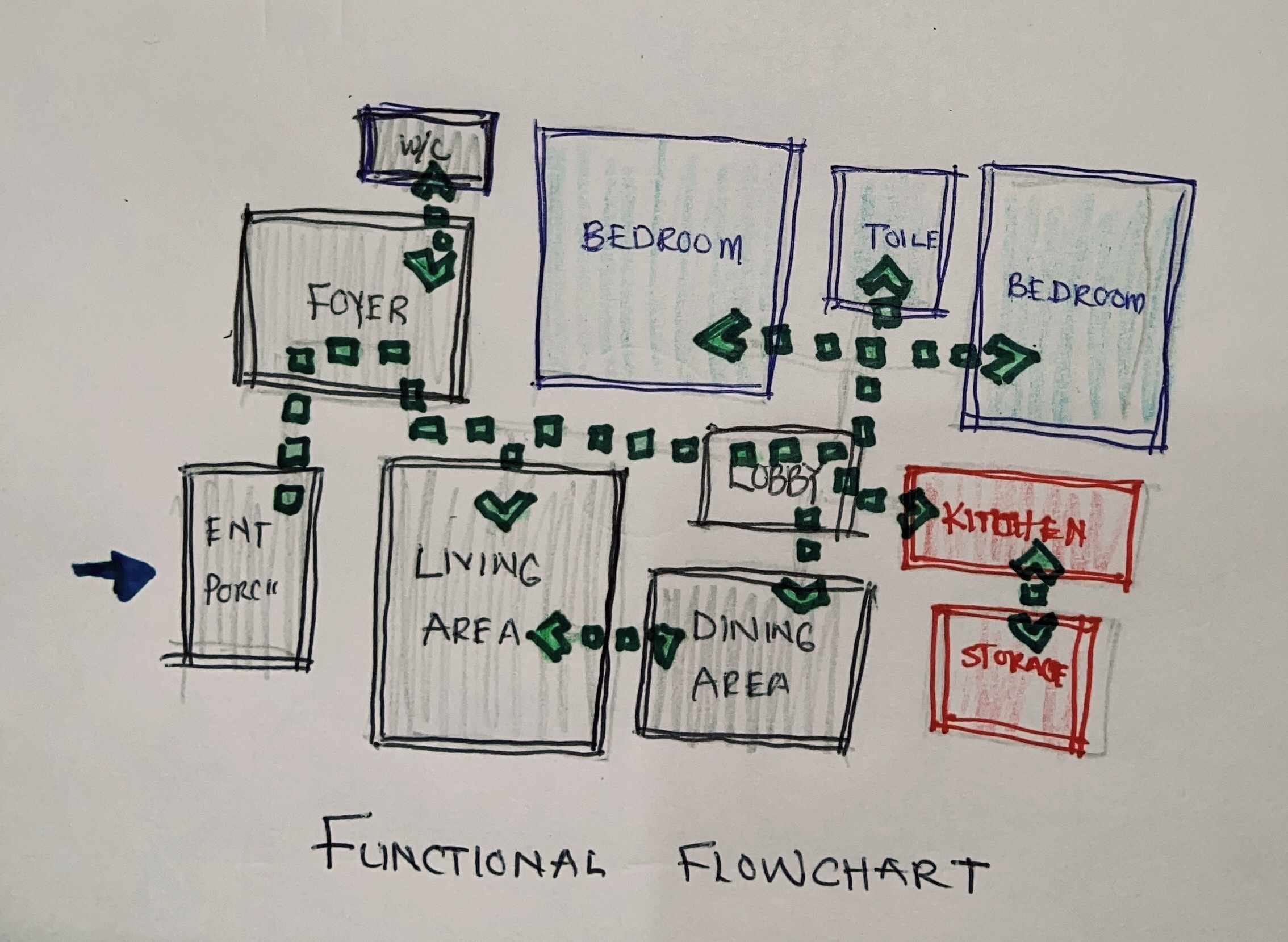
Bubble Diagrams helped us zone the spaces/functions of the proposed design and understand how each zone interacts with one another and how they are connected, while Functional Flowcharts helped us connect spaces and functions to each other to bring about functionality and circulation routes within the building.
Finally, we conducted a Space Analysis to understand the space needed to make the proposed spaces/functions functional and comfortable for the user.
Now, how do all these steps play a role in creating a floor plan? The answer is right here in this post.
Generating a Floor Plan from Your Design Preliminaries
Let’s take a look at our functional flowchart. We have the spaces we need for the design and we know how the connect on one another.
Functional Flowchart
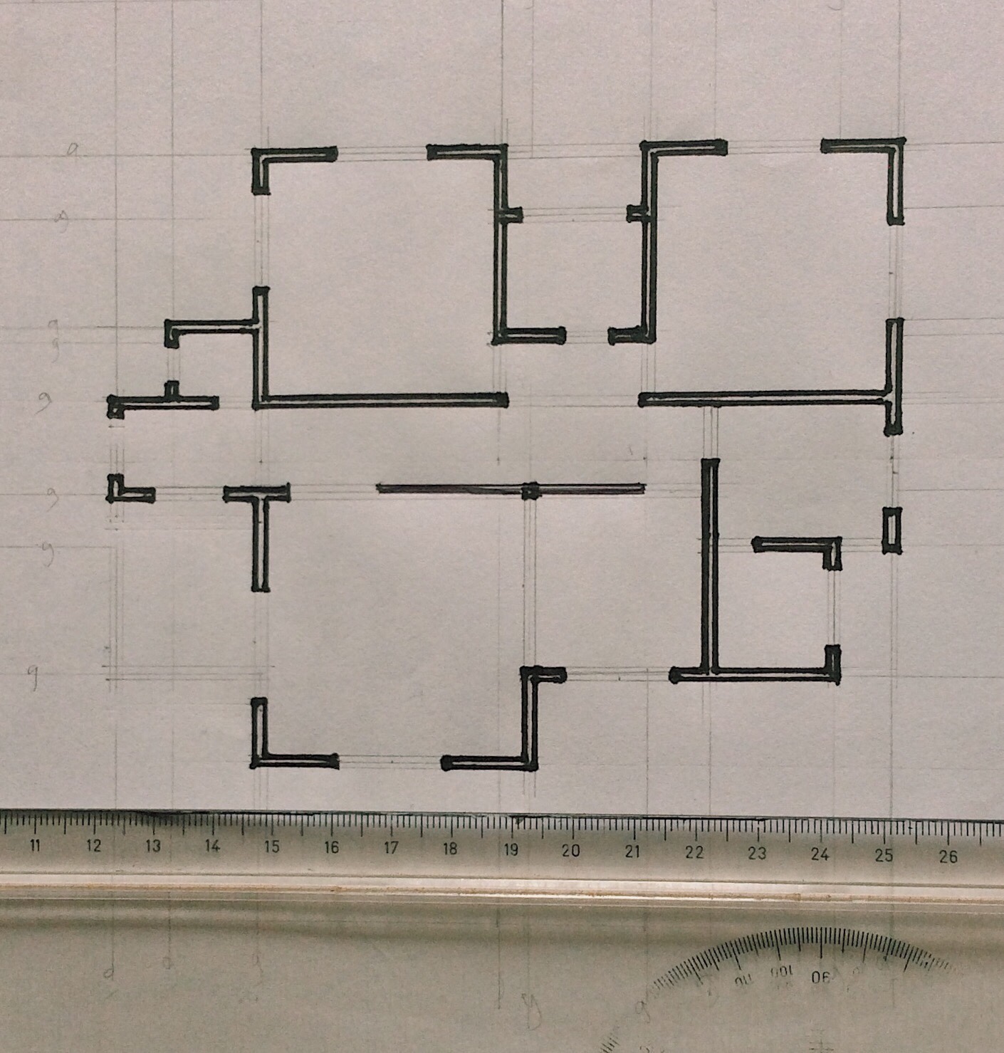
The next step would be assigning dimensions to these spaces. The dimensions we will be using come from the space analysis conducted. Being it a sketch, the shape of the floor plan may not be the final outcome after assigning dimensions. One way to sketch to scale is by using sketchpads that have grids or dots. You can use the grids as a guide to help you sketch floor plans to scale.
Flowchart to Rough Sketch
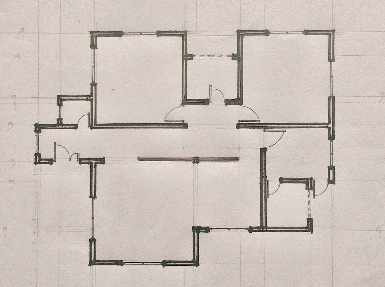
There might be a variation of walls used in the design. There might be masonry walls, curtain walls, partition walls, etc. These walls all have various thicknesses and styles which represent them. Add this to your sketch to start understanding the final outcome.
Adding Wall Thickness
We then add openings to the sketch. We determine the positions of doors and windows. It is necessary to research the type of windows and doors you want to use in your design. Ensure you achieve cross ventilation when positioning windows, and doors are often positioned to rest on walls.
Adding Openings
Next, we determine the position of fixtures and furniture. Fixtures are permanent pieces of furniture that can not be moved like sinks, toilet seats, cabinets, stairs. It is important to indicate the position of each fixture using its appropriate symbol.
Adding Fixtures and Furniture
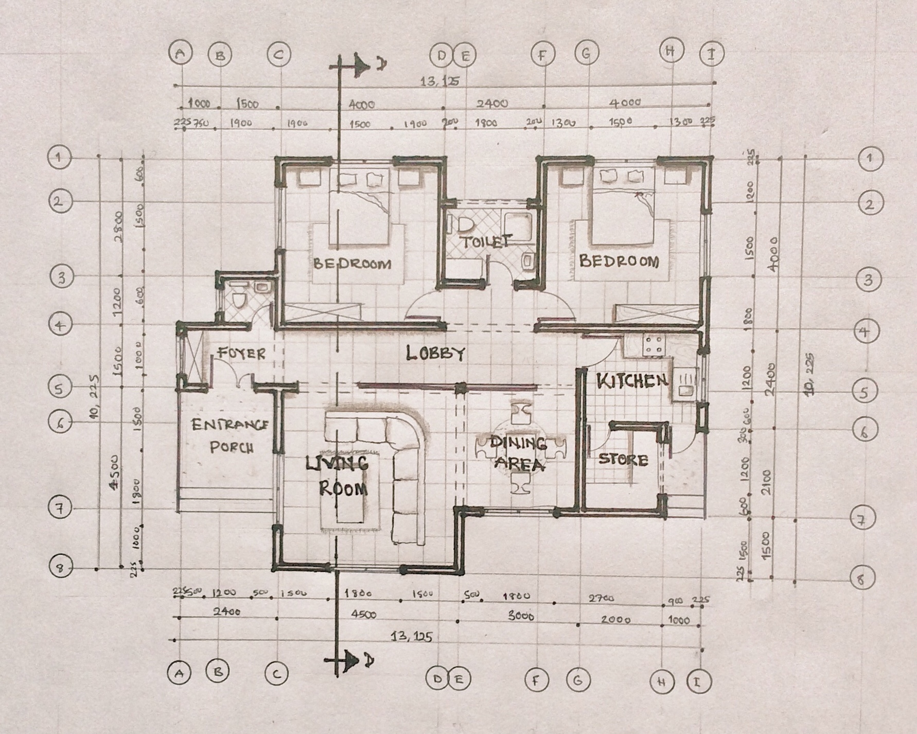
Finally, we add other details like hidden objects, floor finishing, labels, etc. These give more details to the floor plan and help others understand each aspect of the floor plan.
Adding Other Details
Floor Plan Graphics
To draw a floor plan, there are certain graphical and design elements you need to consider.
Scale
The scale used in drawing a floor plan depends on the size of the floor plan, the available drawing space, and the level of detail to be shown. Generally, we use scale 1:100 to draw a floor plan. For large floor plans, the scale moves to 1:200. To show more details on a floor plan, we use scale 1:50 (scale is in millimeters).
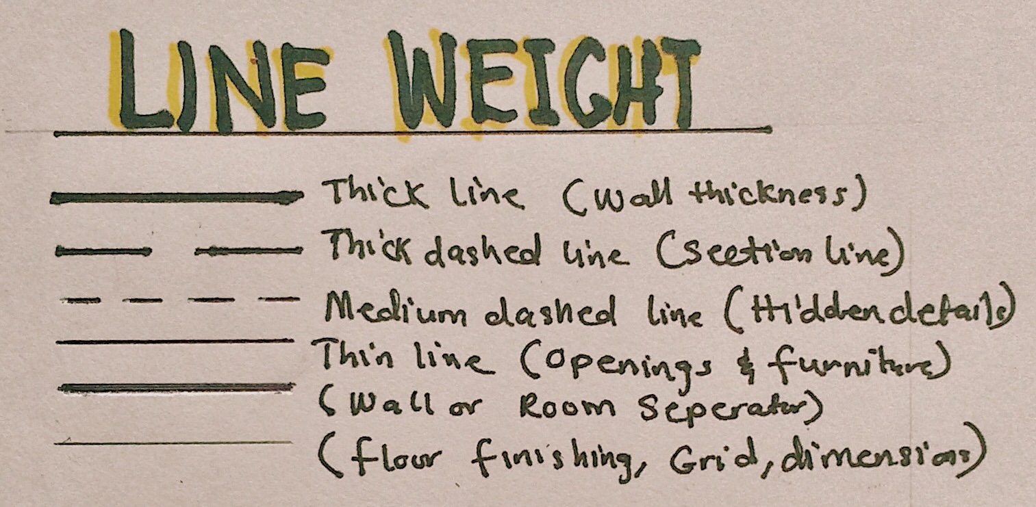
Line weight
There are a lot of line weights displayed in a floor plan. The most obvious one being wall thickness. It is the thickest of them all. Openings and fixtures are drawn in a medium thickness while floor finishing and dimensions are drawn with thin lines.
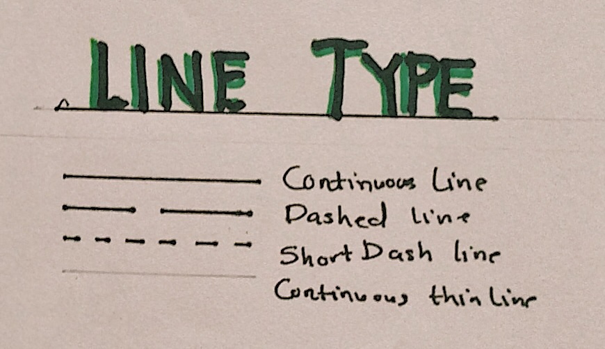
Line type
Walls, openings, fixtures, furniture are drawn using continuous lines. The section line is a thick broken line, while hidden objects are drawn with short dashes. Grid lines are thin chained lines.
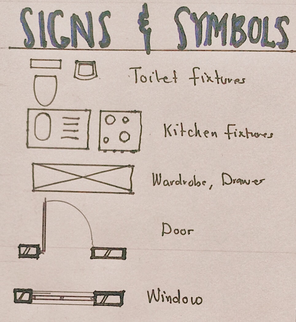
Signs and symbols
Floor plans have a mixture of many signs and symbols. Below is a diagram of some signs and symbols used in a floor plan:
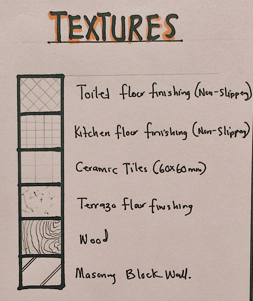
Textures
Here are some textures we adopt in designing floor plans:
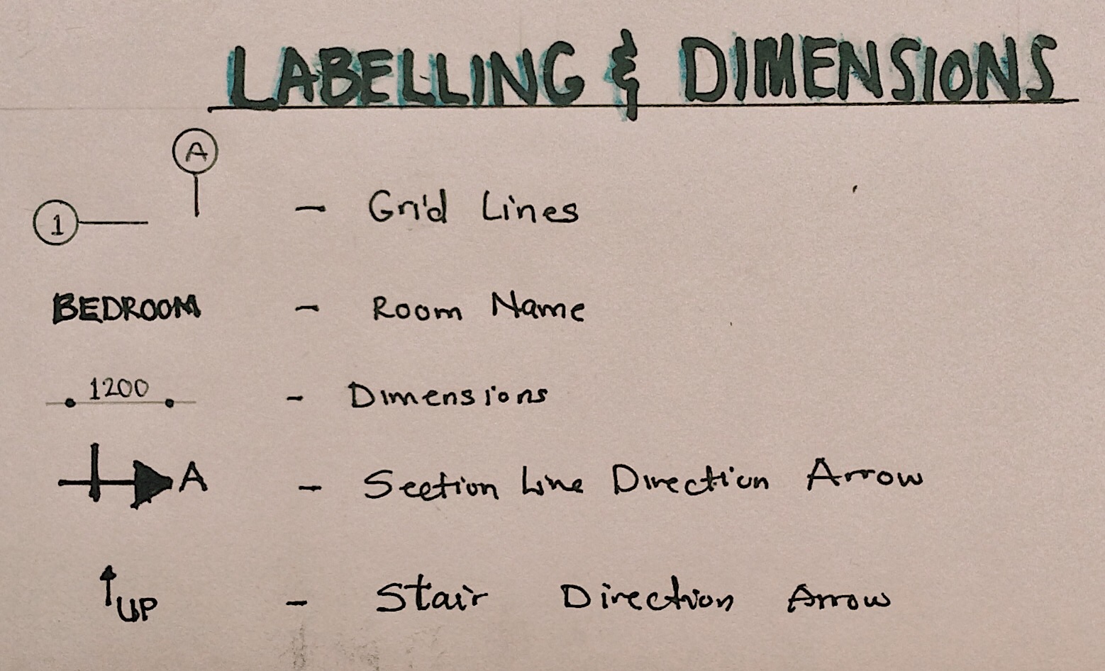
Labelling and Dimensions
Labelling spaces, indicating stair movement, adding grid lines and adding dimensions to the floor plan are basically the final touches. They convey more information that help you communicate certain details.
Floor plans are usually the starting point for other drawings; therefore, it is important to get it done right. Stay tuned to read about other drawings in future posts. Thank you for reading!
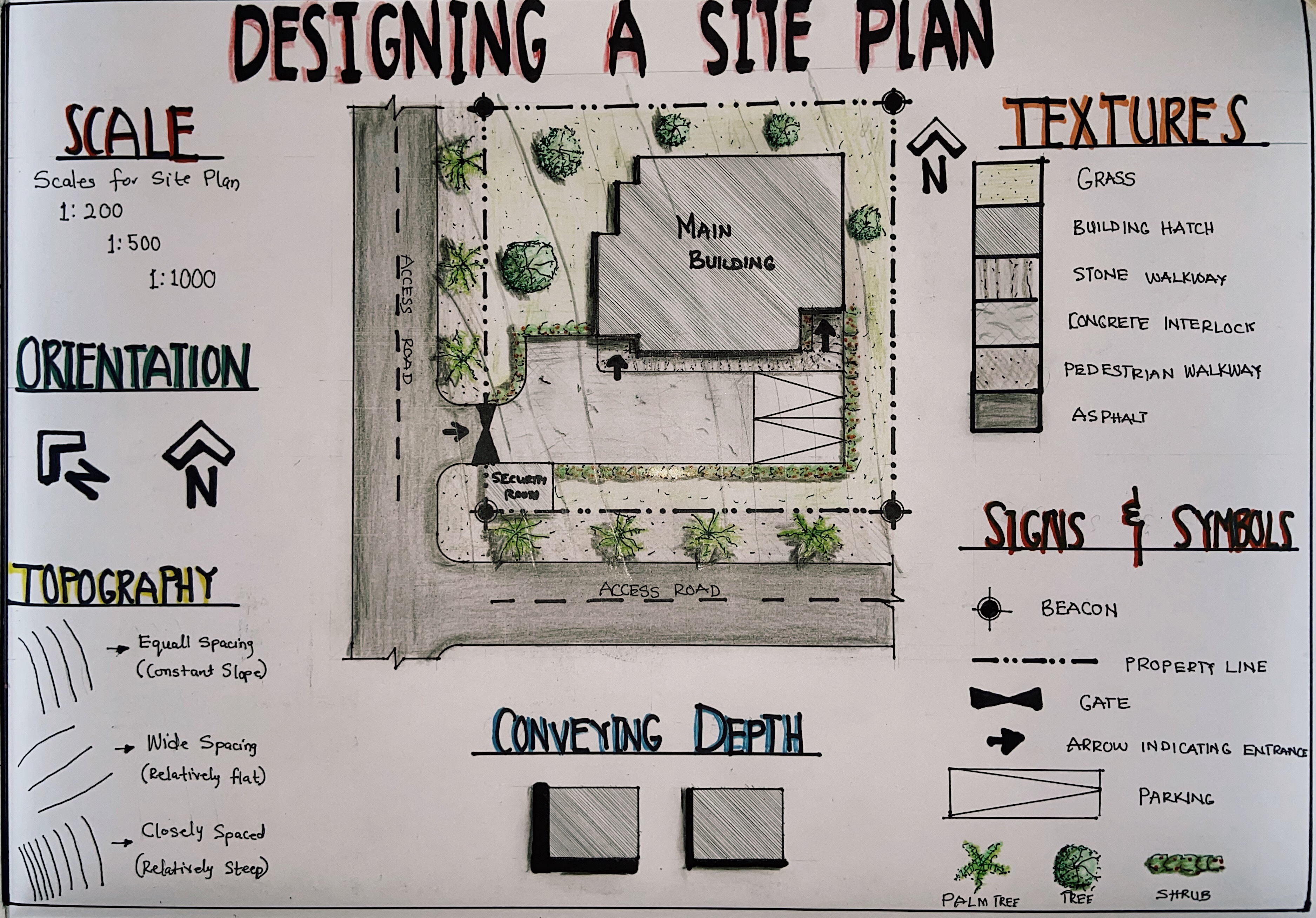
A site plan is a visual representation of a building or a building complex describing its location and orientation in a plot of land and in relation to its context. A site plan is drawn in a two-dimensional view, and it is a view from the top, looking down onto the site. Site plans are developed after a thorough Site Analysis has been conducted. They show existing and proposed features of the design. Existing features may be the site topography, vegetation, existing infrastructure or buildings (those that are to be retained in the design). Proposed features include the proposed building, proposed landscaping or infrastructure.
A Site Plan
Site plans are designed to describe the following features:
Property lines: these are the legally recorded boundaries of the site.
Topography: contour lines on the site plan describe the terrain of the site.
Natural site features: these can include trees, landscaping, water bodies.
Existing or proposed site constructions: these can be walkways, roadways, landscaping.
Existing or proposed site utilities: these might be drainage facilities, plumbing pipes, gas lines, etc.
Pedestrian and vehicular entry points and paths.
Legal constraints: such as setbacks, rights-of-way, etc.
Site Plan Graphics
To draw a site plan, there are certain graphical and design elements you need to consider.
Scale
The physical size of a site is too large to fit into drawing sheets. This is where scale comes into play. You can adopt appropriate scales depending on the available drawing space and the level of detail you want to show. In architecture, we have specific scales we use for each type of drawing. The ideal scales for a site plan include 1:200, 1:500, or even 1:1000 (scale in millimeters). For a detailed site plan, you can adopt 1:200, while you can use 1:500 or 1:1000 for large site plans that do not require much details.
Scale
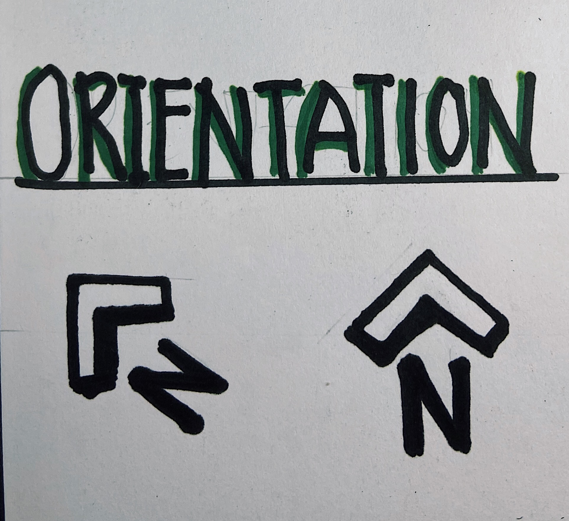
Orientation
There has always been a huge debate as to how a site plan should be oriented. Some schools of architecture suggest that the site plan should be oriented the same way the floor plans have been drawn to maintain a relationship between the site plan and the floor plan, while other schools suggest that the North Arrow determines the orientation of the site plan on paper. The North Arrow is drawn in the top right-hand corner of the paper and the site plan is drawn in reference to it. Find out which style your school uses and adopt that in your design.
Orientation
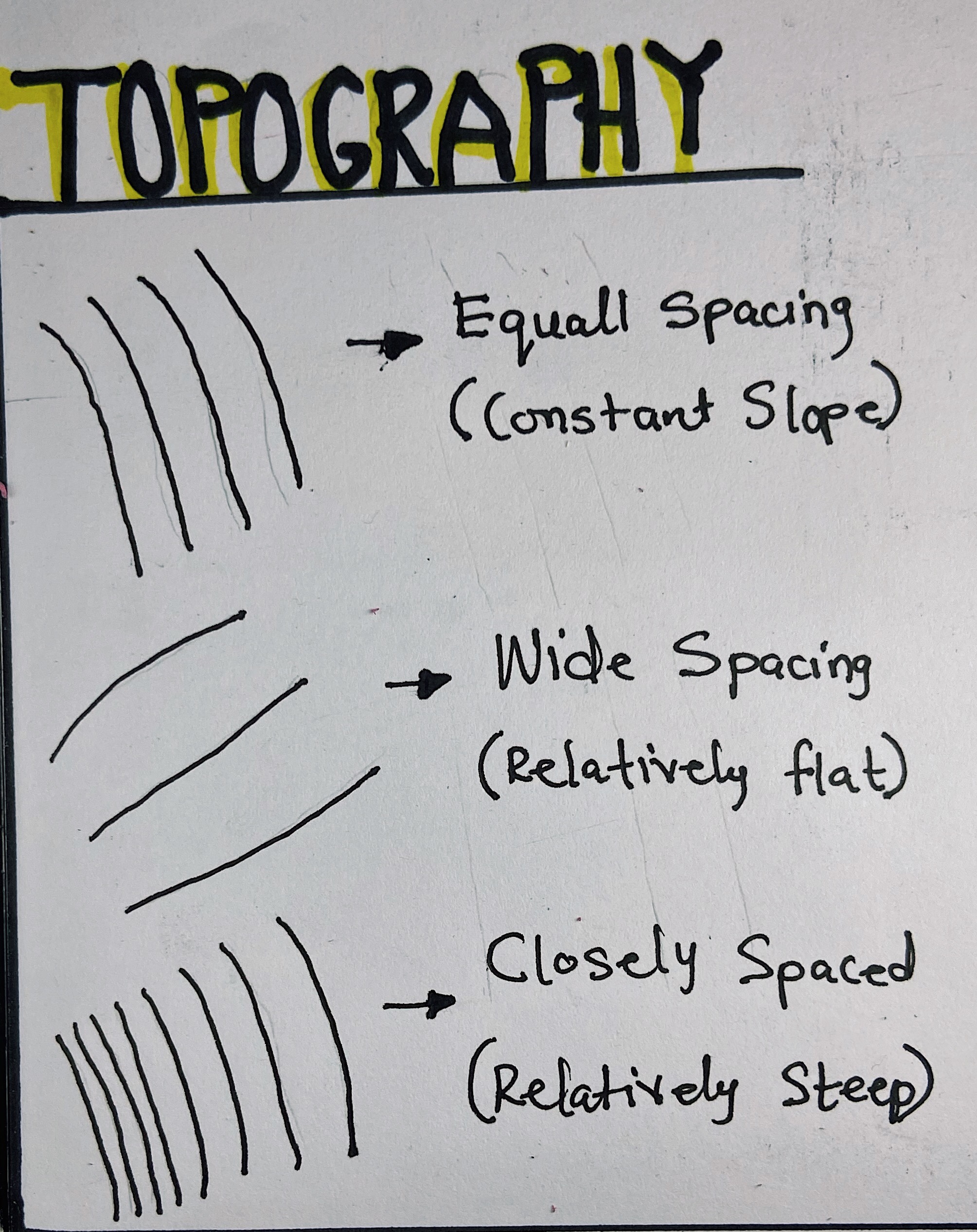
Topography
Contour lines are the graphic convention we use to convey the terrain of a site. Contour interval is determined by the scale of a drawing, the size of the site, and the nature of the topography. The horizontal distances between contour lines in a site plan are a function of the slope of the ground surface. We can determine the topographical nature of a site by reading this horizontal spacing. Contours spaced far apart indicate a relatively flat or gently sloping surface. Equally spaced contours indicate a constant slope. Closely spaced contours indicate a relatively steep rise in elevation.
Topography
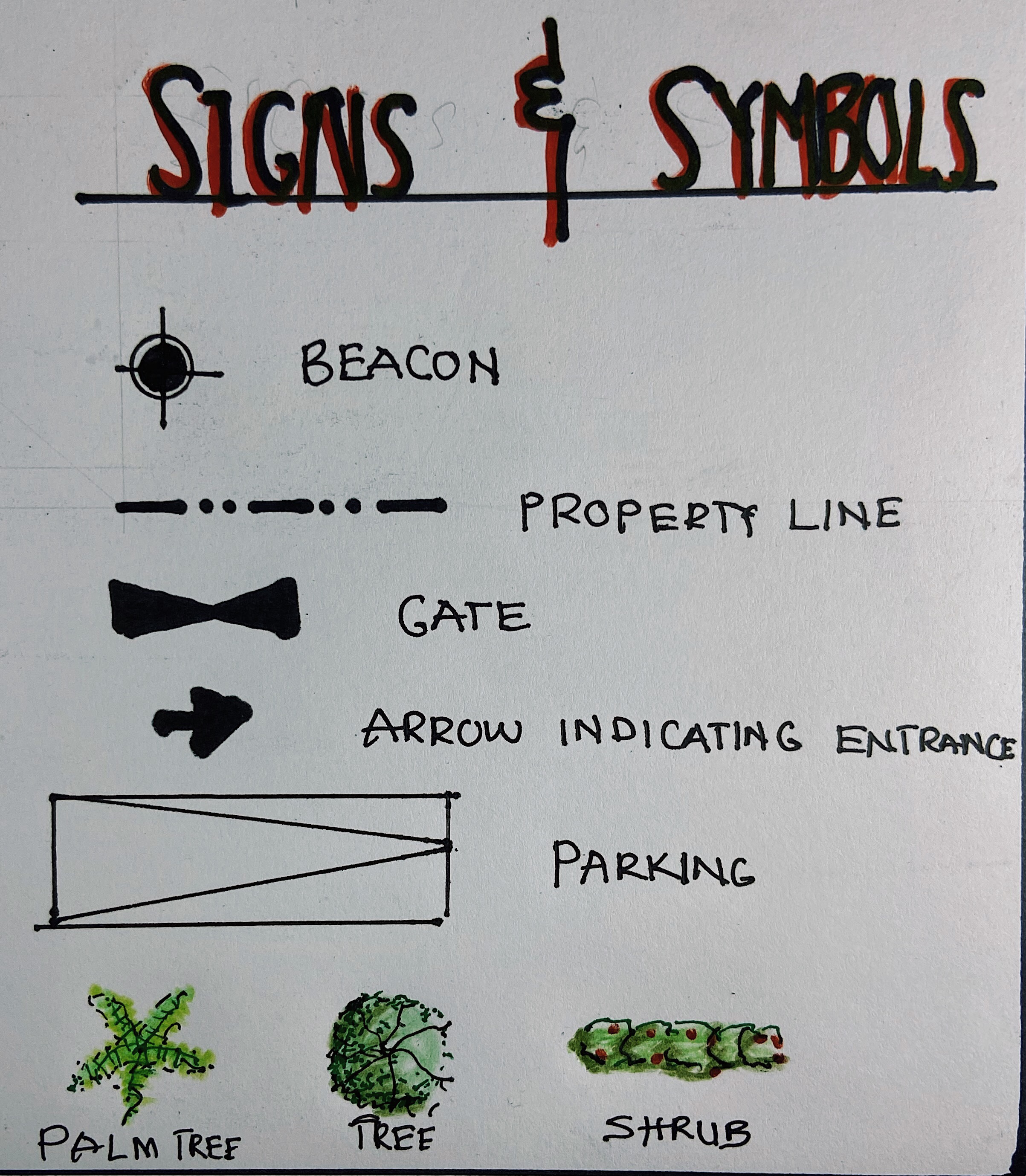
Sign and Symbols
Different signs and symbols are used in the design of a site plan. A mixture of line types and line weights helps represent each and every feature of the site plan, for example, property line is represented by a broken line consisting of relatively long segments separated by two short dashes or dots, contour lines are represented by thin continuous lines, hidden elements like underground tanks or septic tanks are represented by thin dashed lines. There are also symbols that indicate orientation (North Arrow), street signage, flow of traffic, parking, landscaping elements, etc.
Sign and Symbols
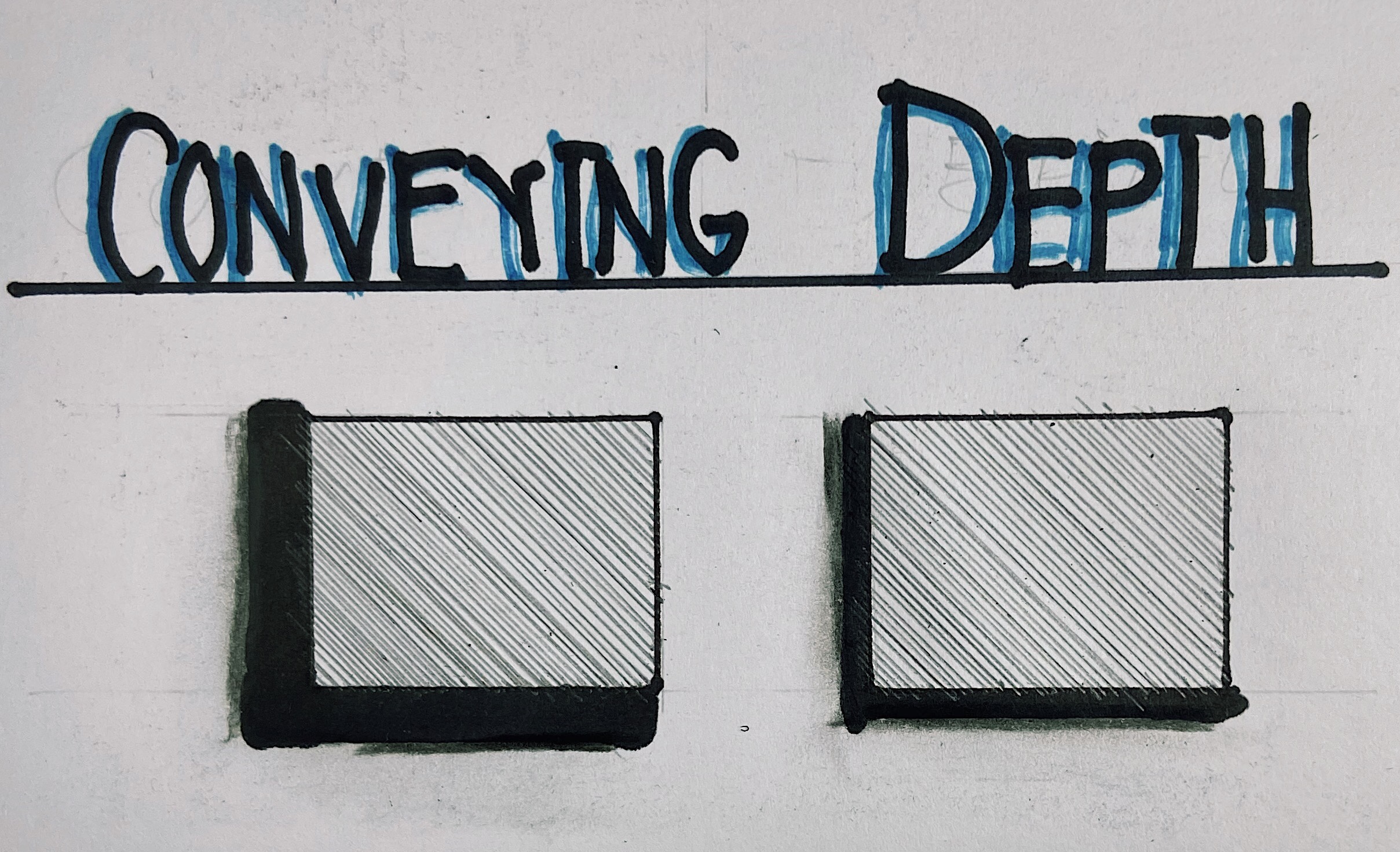
Conveying depth
This can be achieved through shading. Casting shadows helps convey the height of site elements in relation to the site. This gives a three-dimensional illusion to the drawing if done properly.
Conveying Depth
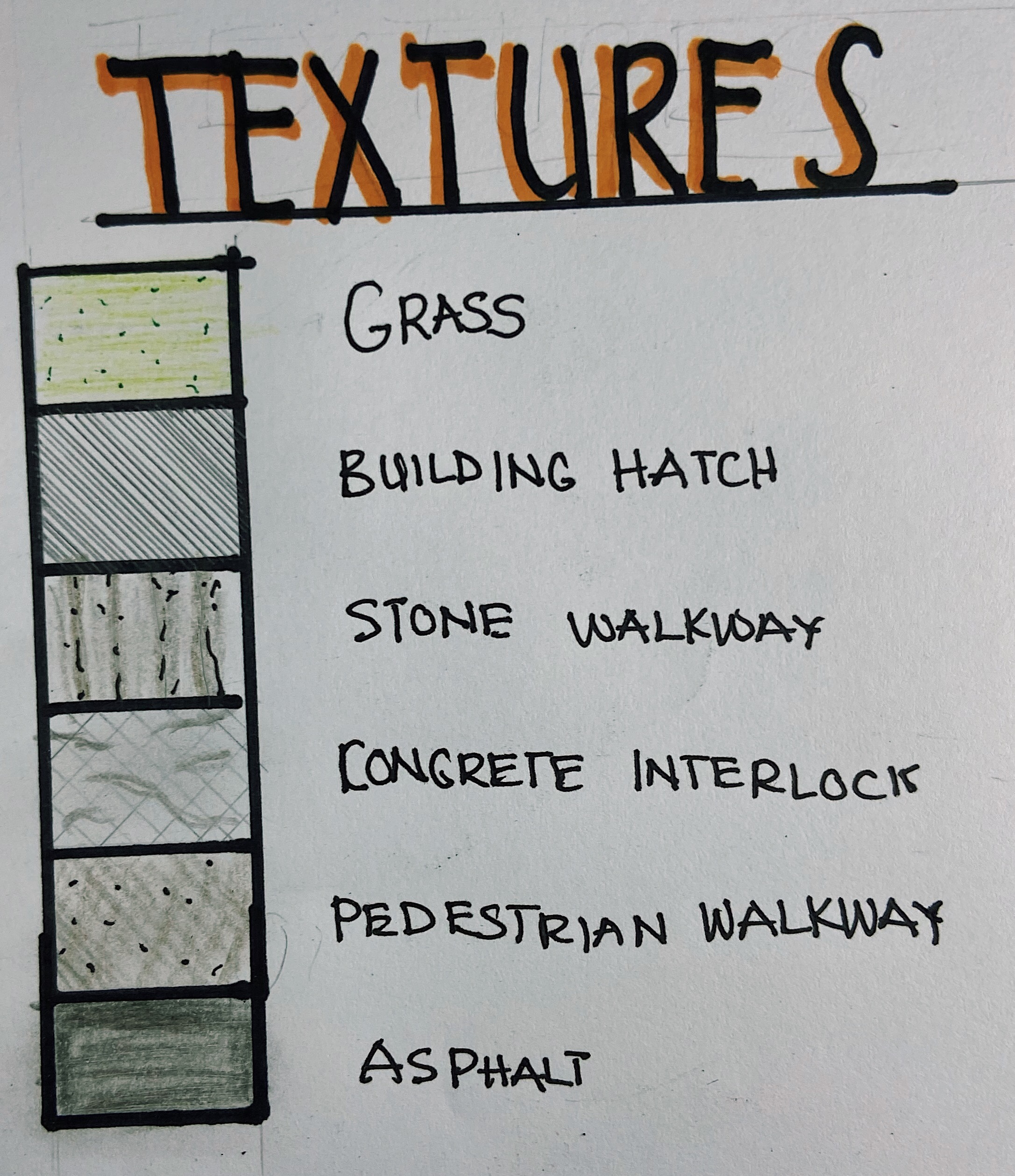
Textures
It is important to represent textures on a site plan. This gives it a more realistic touch. Textures usually found in a site plan include grass, trees, stone walkways, interlocks, asphalt, roofing materials, water bodies, etc. You can always add color to your drawings to give it more meaning.
Textures
Applying all these elements together will help you produce a functional and aesthetic site plan. It should be like you are telling the story of the site and the building. For other people to understand your design, you must tell the whole story. The more details you describe on your site plan, the less room you leave for interpretation.
What guidelines does your school have regarding site plans? Do you rotate your site plan, or rotate your north arrow? Do you show the roof of your building or do you simply hatch the building area? Comment down below and stay tuned for more posts!
Fundamentals of design or principles of designs are applied to the elements of design that bring them together into one design. How one applies these principles determine how successful a design maybe. They represent the basic rules of how to arrange a composition and create a successful design. In other words, they guide us in the way we arrange the elements of design. Sometimes we look at an image or object and we find it aesthetically pleasing or easy on the eye but we may not quite understand why. The reason is that one or more of the principles of design are at work. Here are the basic principles of design:
Harmony
Balance
Hierarchy
Scale and Proportion
Emphasis or Dominance
Similarity and Contrast
Harmony
Harmony is an agreement between the shapes that stresses the similarities of all parts. In other words, the shape of one part should “fit” the shape of the adjoining elements. Shapes should ”fit” properly in their positions and spaces. The following are aspects that make a design harmonious:
Proximity: a sense of distance between elements.
Similarity: ability to seem repeatable with other elements.
Continuation: the sense of having a line or pattern extended.
Repetition: elements being copied or mimicked numerous times.
Rhythm: achieved when recurring positions size, colour, and use of graphic element has a focal point interruption.
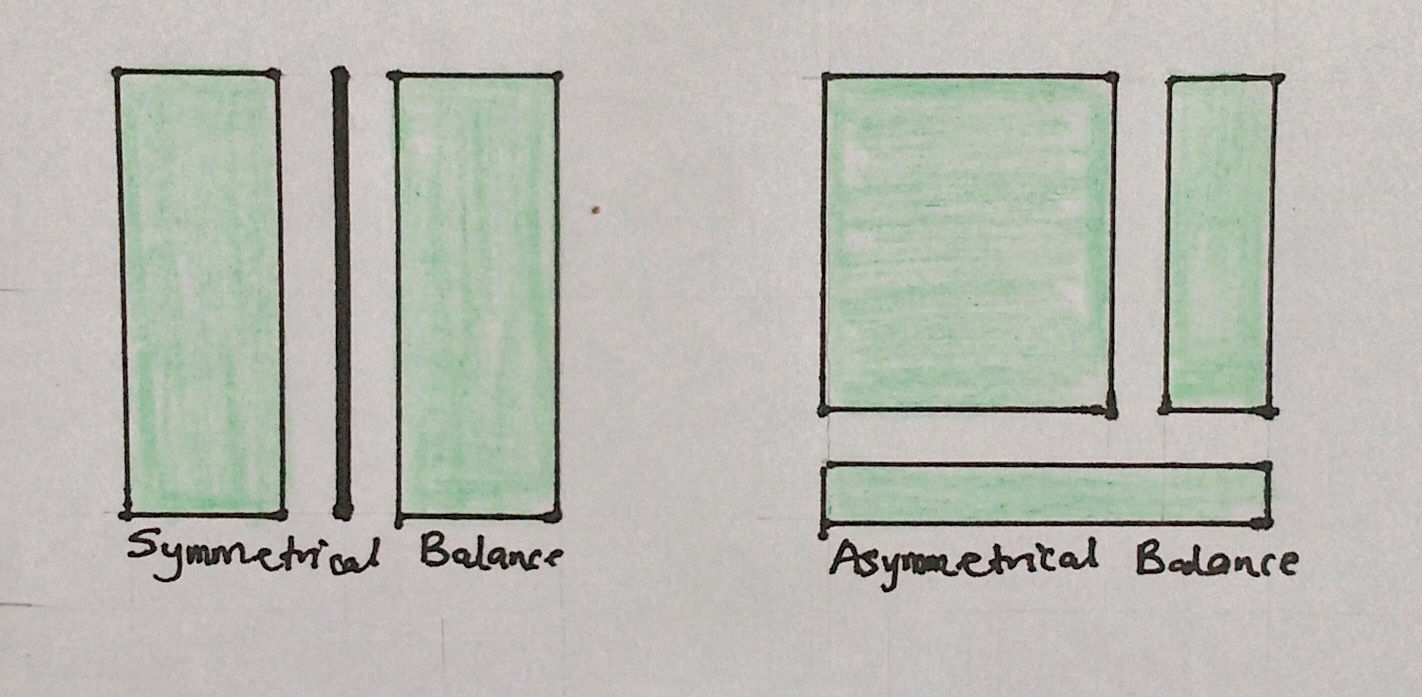
Balance
Balance refers to the arrangements of design elements within a composition, how they relate to each other and the overall composition. Elements can have different visual weights dependent on their size, shape or colour and if positioned poorly they can unbalance a composition. There are 3 types of balance used in design:
Symmetry: elements on either side of the axis are arranged similarly.
Asymmetry: elements on each side differ in shape but still are in visual equilibrium.
Radial: elements are arranged around a circular form.
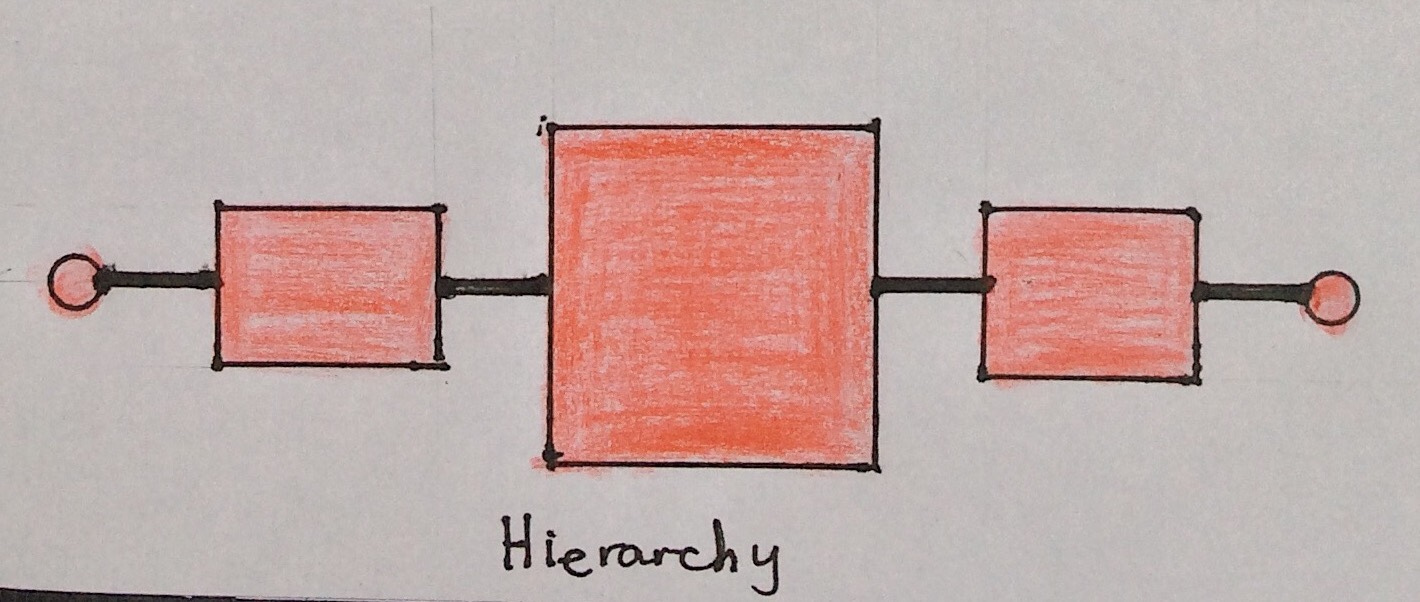
Hierarchy
Hierarchy is another principle that relates to how well elements can be understood visually. It refers to the importance of elements within a design. The most important elements should appear to be the most important. Hierarchies are represented in the following ways:
Trees: elements arranged in order of a tree with a trunk, branches and sun-branches.
Nest: elements mapped on to each other as parents, children and grandchildren.
Weight: elements of the same weight belong to the same class of a hierarchy position.
Scale and Proportion
Proportion is simply the comparative size of elements relative to each other. Proportion can be used in a composition to create a sense of distance or demonstrate a size difference. Proportion can also be used to create or unhinge the balance in a composition as their visual size and weight will automatically establish themselves in the composition.
Size: elements of different size in relationship with each other.
Ratio: elements related to each other in a ratio appears together in visual harmony.
Division: these create a focal point that automatically gives a sense of the relationships.
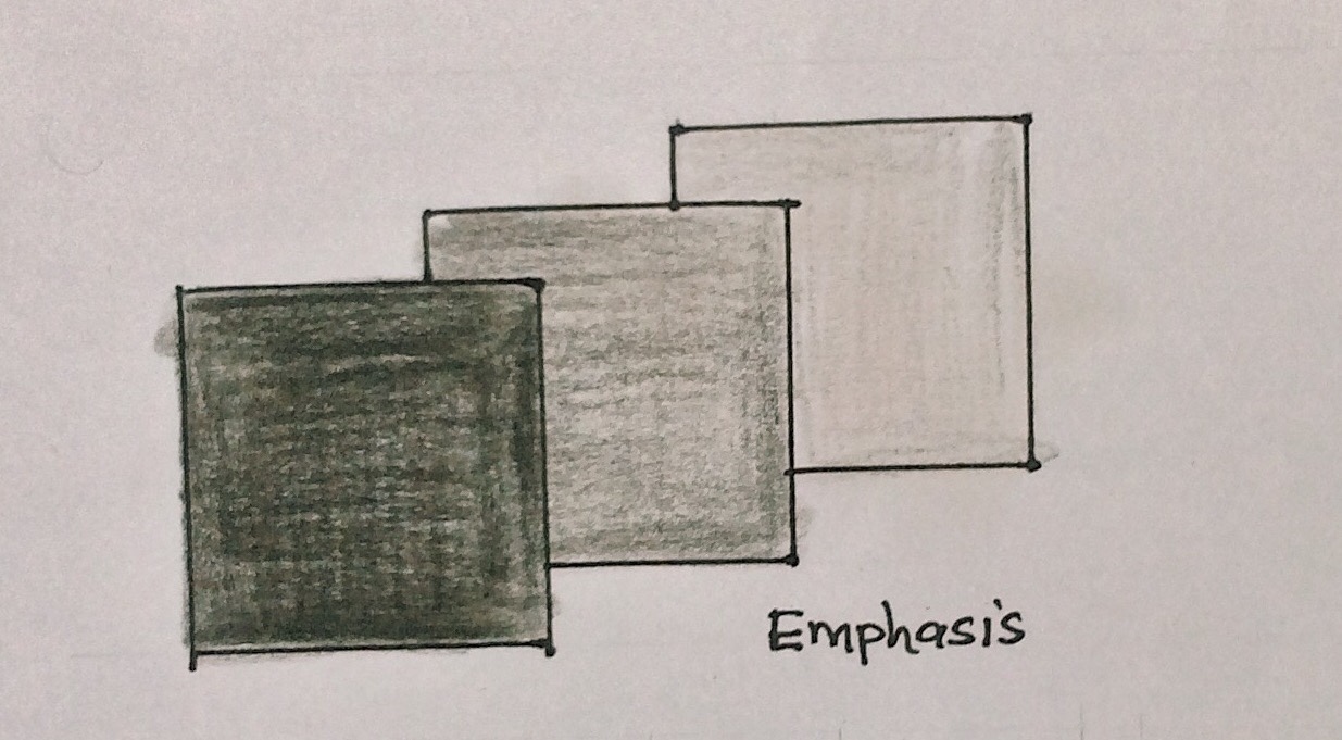
Emphasis or Dominance
Dominance (also known as emphasis) may seem similar to proportion but is actually more to do with the visual weight of an element. The dominant part of a composition is the one that stands out the most or appears closest to you. The following are components of emphasis or dominance:
Highlight: breaking the visual hierarchy using form to lay emphasis.
Colour: to distinguish between elements in a series of similar for.
Size: elements of different sizes focus the viewer’s attention accordingly.
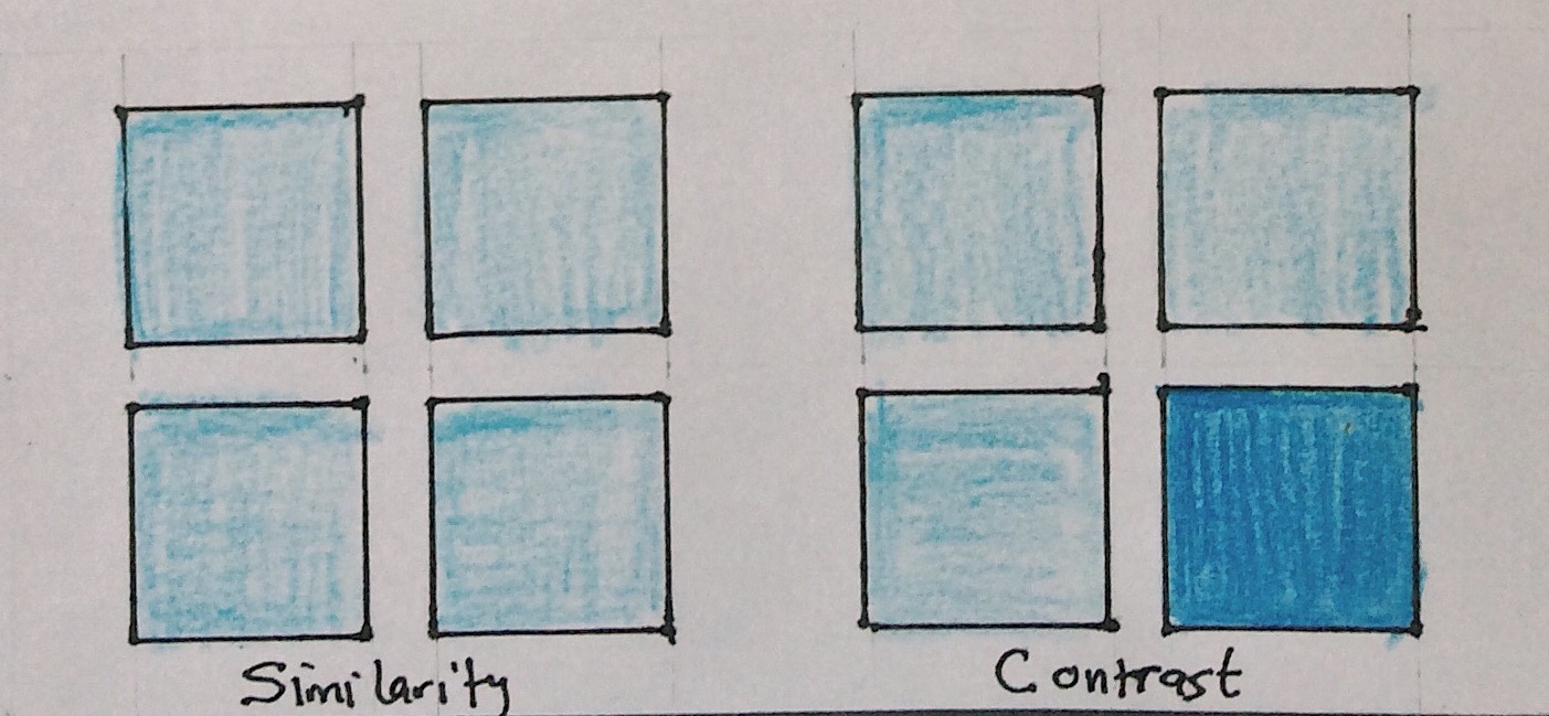
Similarity and Contrast
Contrast refers to the arrangement of opposite elements in a piece so as to create visual interest, excitement and drama. This can be done in a variety of ways such as through light vs. dark colours, rough vs. smooth textures, large vs. small shapes, etc.