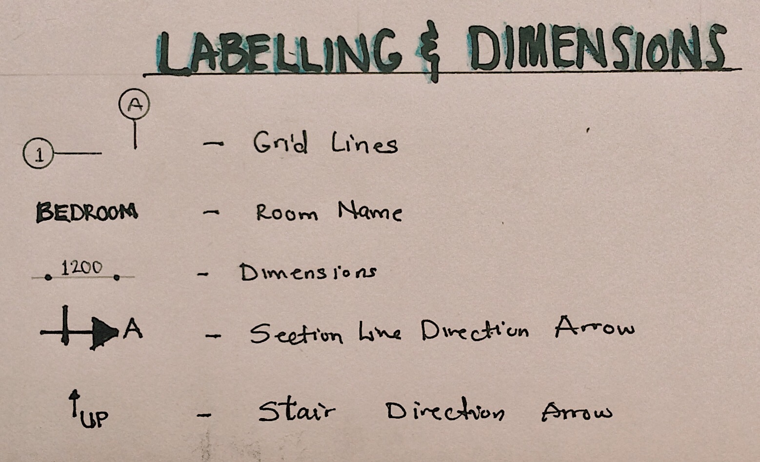
Perspective drawings are drawings in 3 dimensional views that are used to create realistic views of a building or an object. Perspective drawings help us show more than one view at once, for example, we can see two elevational drawings at once from a perspective drawing.
Perspective drawings have many types and forms, but there are 3 common types of perspective drawings. These are One-point Perspective, Two-point Perspective and Three-point Perspective. Along the journey of your training in architecture school, you will be required to draw all the three types.
Before we jump into explaining the types of perspectives, let us first go over basic terms and principles that you need to understand before drawing a perspective.
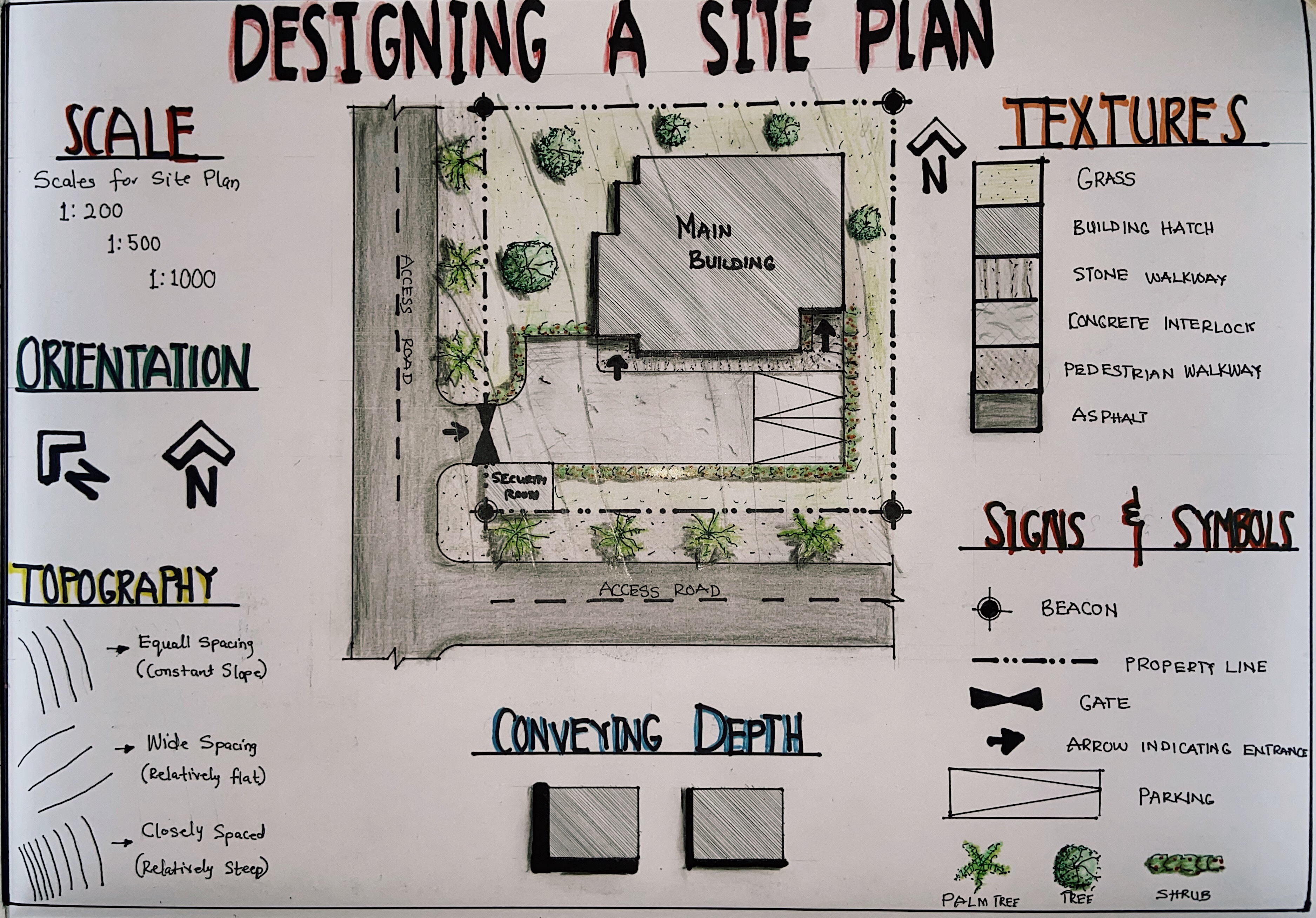
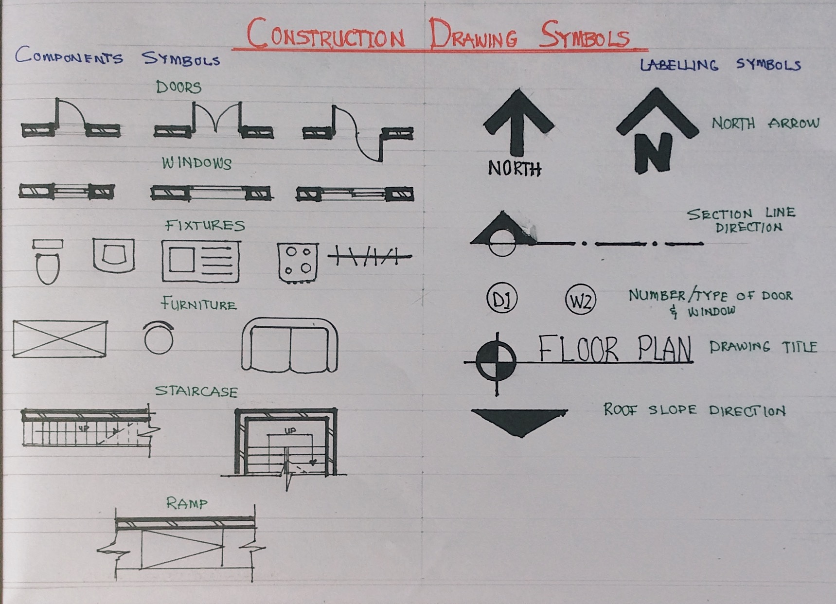
Terms and Principles of Perspective drawings
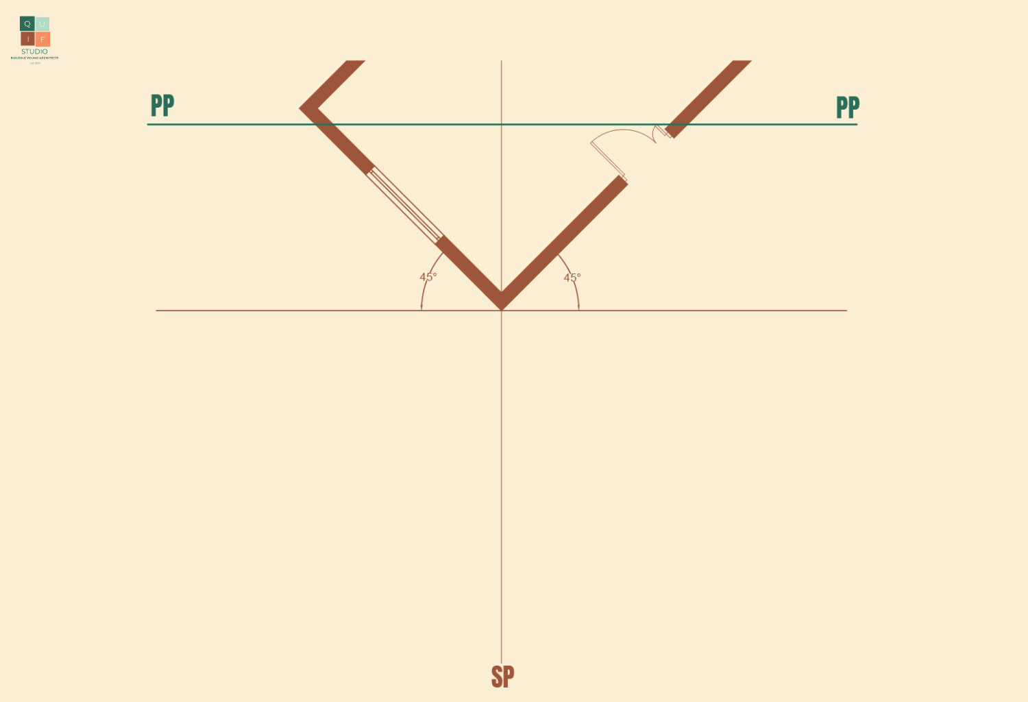
We understand that a perspective drawing is a 3-dimensional (3D) drawing represented in 2-dimensional (2D) form. We come across perspectives in our everyday activities. From the images we can see in our phones, cameras, laptops to our sketchpads, drawing paper or canvas we are able to perceive 3D objects from flat surfaces. Those flat surfaces can be treated as an imaginary plane from where the object might have been viewed in real life. We call that plane the Picture Plane (PP).
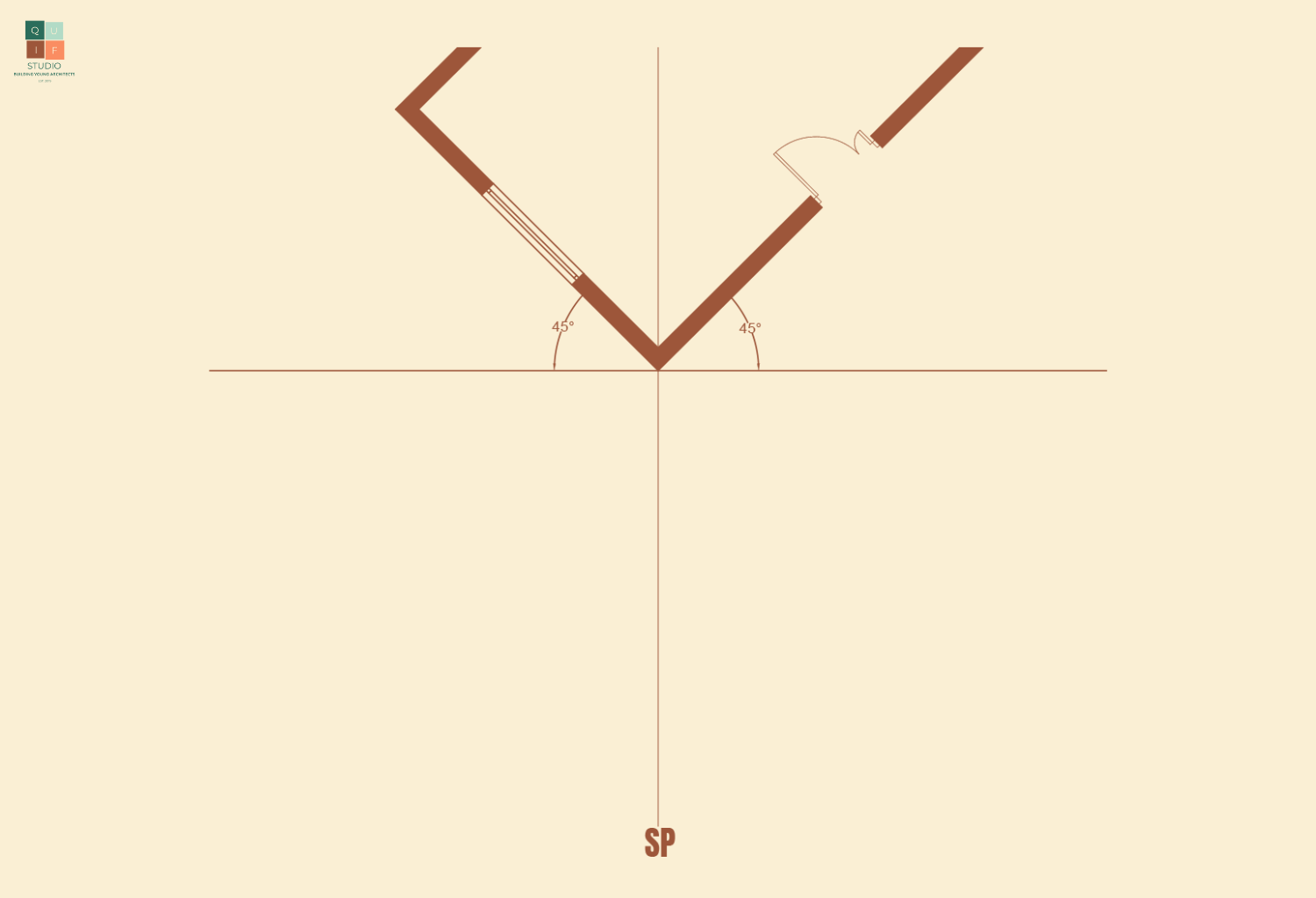
Since we use our eyes to view objects, in drawings, a single eye is used as the primary reference for all the lines in a perspective drawing. The location/position of the eye can determine so much about how we perceive an object. This location/position is referred to as the Station Point (SP).
The station point can have a height from the Ground Plane (GP) which in simpler terms can be described as the floor or surface a spectator is standing on. This is the height or level from where a person is viewing an object.
This height can open up to 3 different angles of view. We have a normal eye level view which is the spectator viewing directly in front of him/her. There is a high angle of view which is referred to as worm eye view. This means the spectator is tilting his/her head up to view an object. Lastly, there is a low angle of view which is referred to as aerial view. This means the spectator is tilting his/her head down to look at an object.

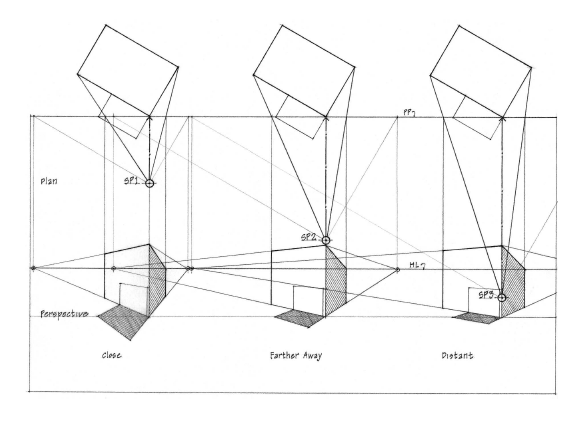
The distance of the spectator or the SP from the object can also have an effect on the drawing. Imagine holding a box in your hand along your eyesight level. The closer the box gets to your eyes, the less you can see. If the box is an arm’s length from your eyes, you will perceive the view of the box better. If the SP is close to an object, the more compressed the drawing becomes. If the SP is further away from an object, the view of the object become wider.
When we view a vast open land, there is always that point where the ground and the sky meet, which is referred to as a horizon. That doesn’t mean that the ground or sky stop there, but it is as far as our eyes can see. It usually forms a line that runs across horizontally. In drawing perspectives, that line is referred to as the Horizon Line (HL). The horizon line is usually imaginary; however, it is a vital part of perspective drawings. Whether we are viewing a beautiful landscape or a building, there is always a horizon line.
Horizon lines are usually used to position Vanishing Points (VP). In perspective view, parallel lines are perceived to converge/move towards a common point. As these lines move towards the point, the appear to disappear or vanish. That point is referred to as a vanishing point. Vanishing points are used as reference points to help guide the projection of parallel lines.
A drawing can have more than one vanishing point. The number of vanishing points gives rise to the 3 common types of perspective drawings earlier mentioned. Let’s describe them below.
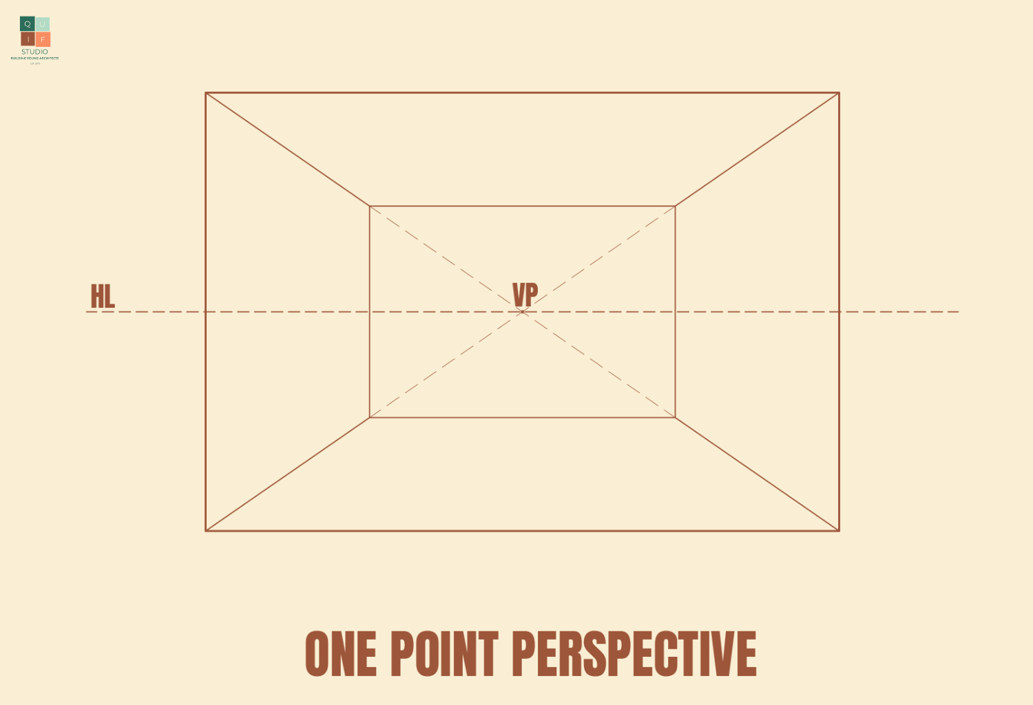
One point Perspective
From the name, this perspective has one vanishing point, which is sometimes centralized. This is best used to draw interior perspective views or drawings that have a central focal point.
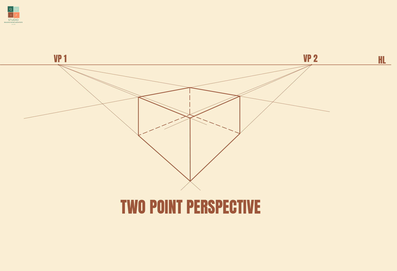
Two-point Perspective
This perspective type has two vanishing points. The closer the vanishing points, the more compressed the drawing is. The further away the vanishing points are from each other, the better the view of the object. Sometimes vanishing points might not fit onto your drawing sheet, which is okay since they are just reference points.
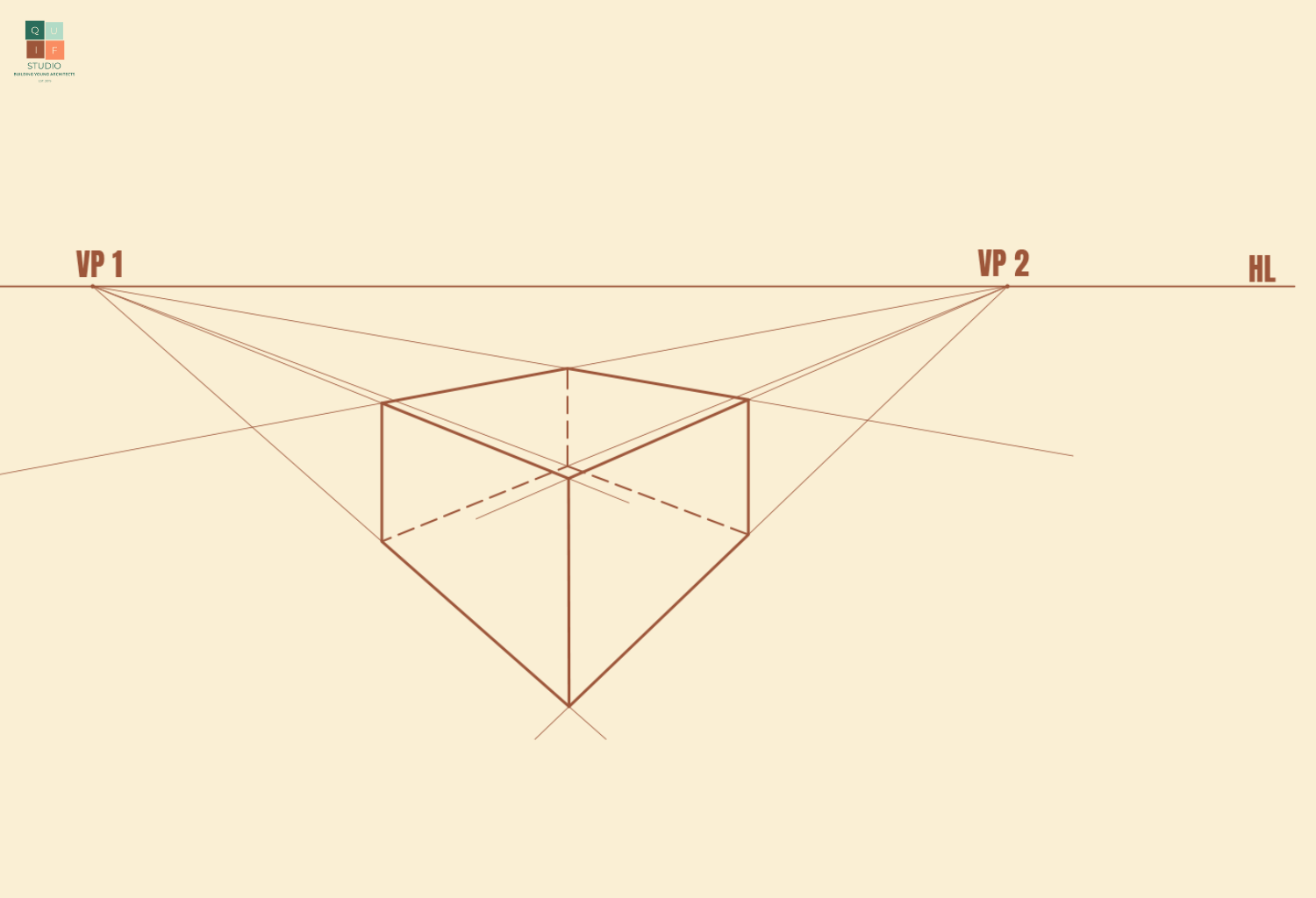
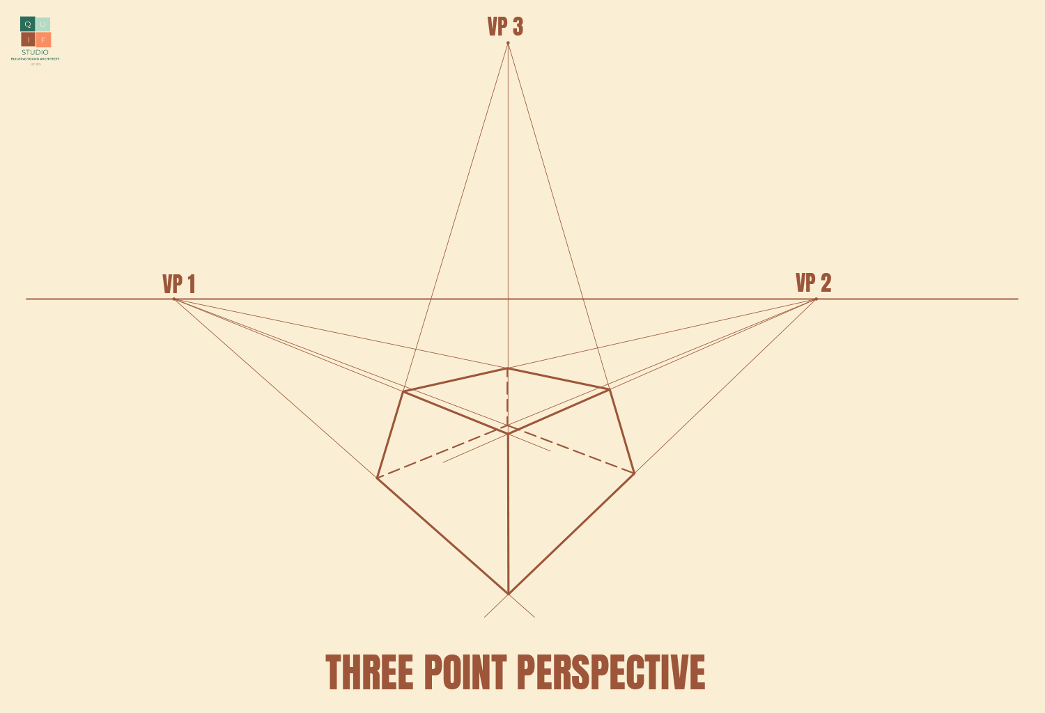
Three-point perspective
This perspective type has three vanishing points. This gives more detail to how objects are perceived in reality. The more vanishing points a drawing might have, the more complex and more detailed the drawing is.
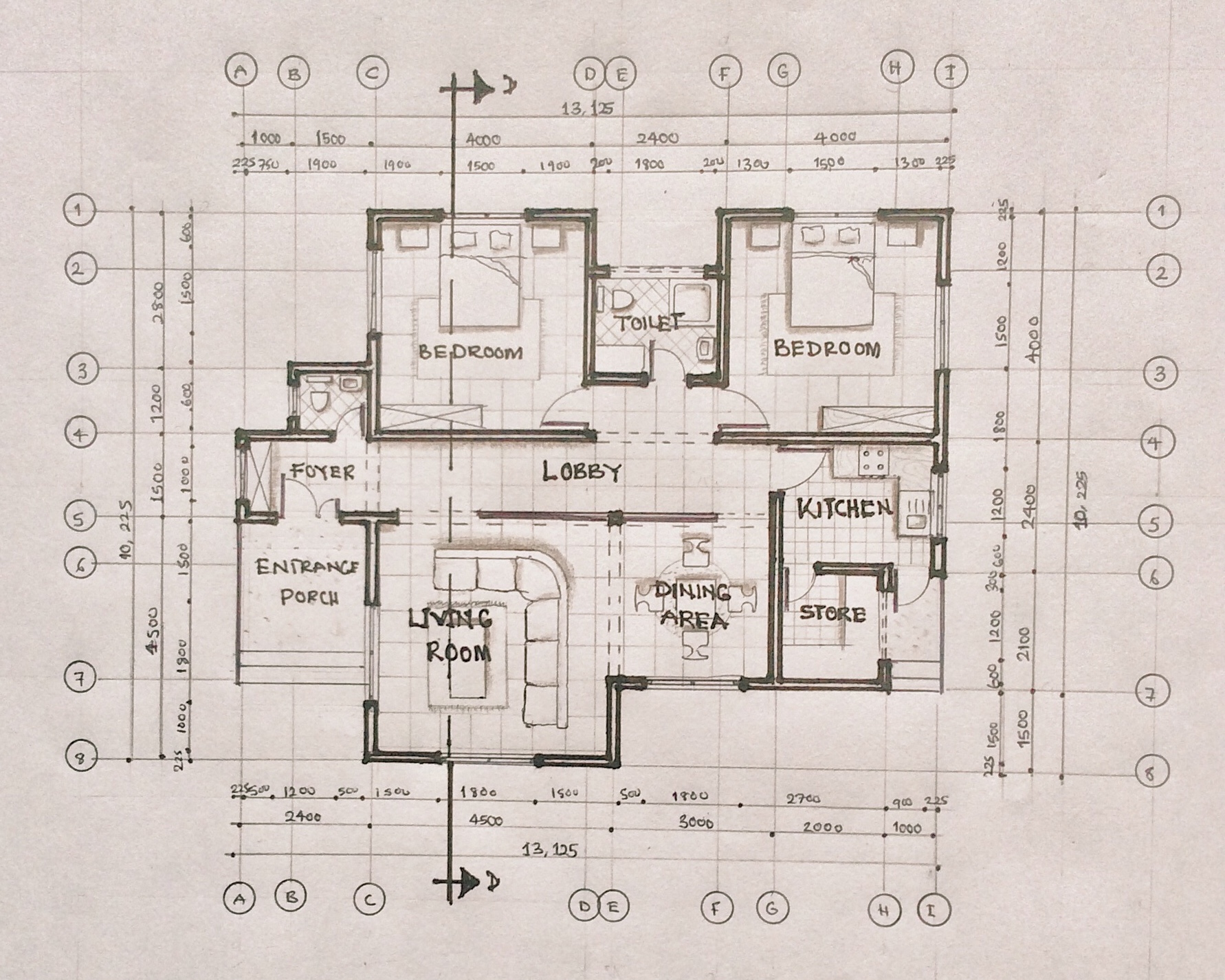
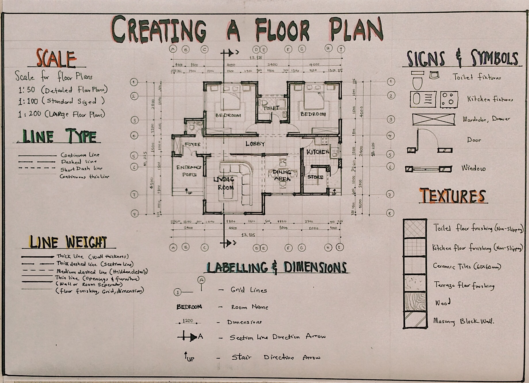
Perspective drawing can be very tricky for a beginner, so for the purpose of this post, we will be using a small rectangular building to draw a two-point perspective.
Generating a perspective
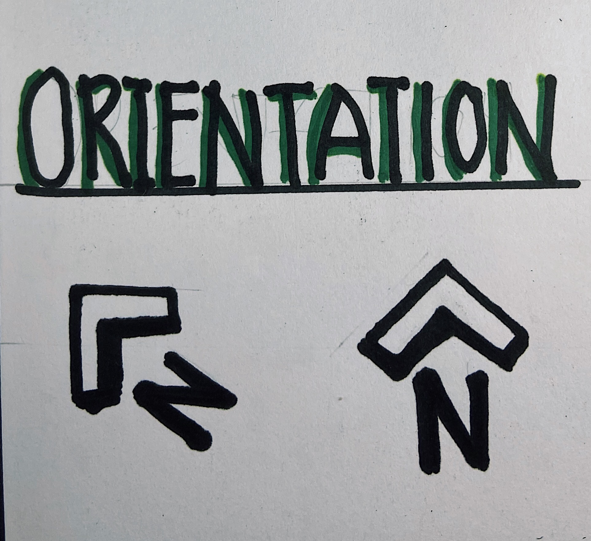
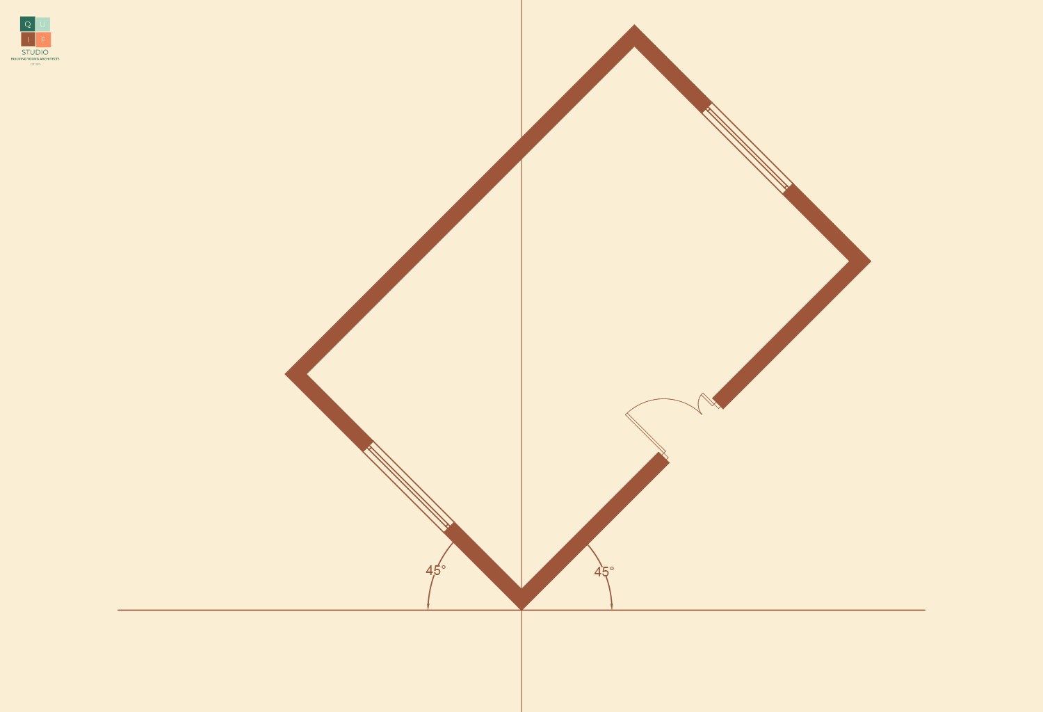
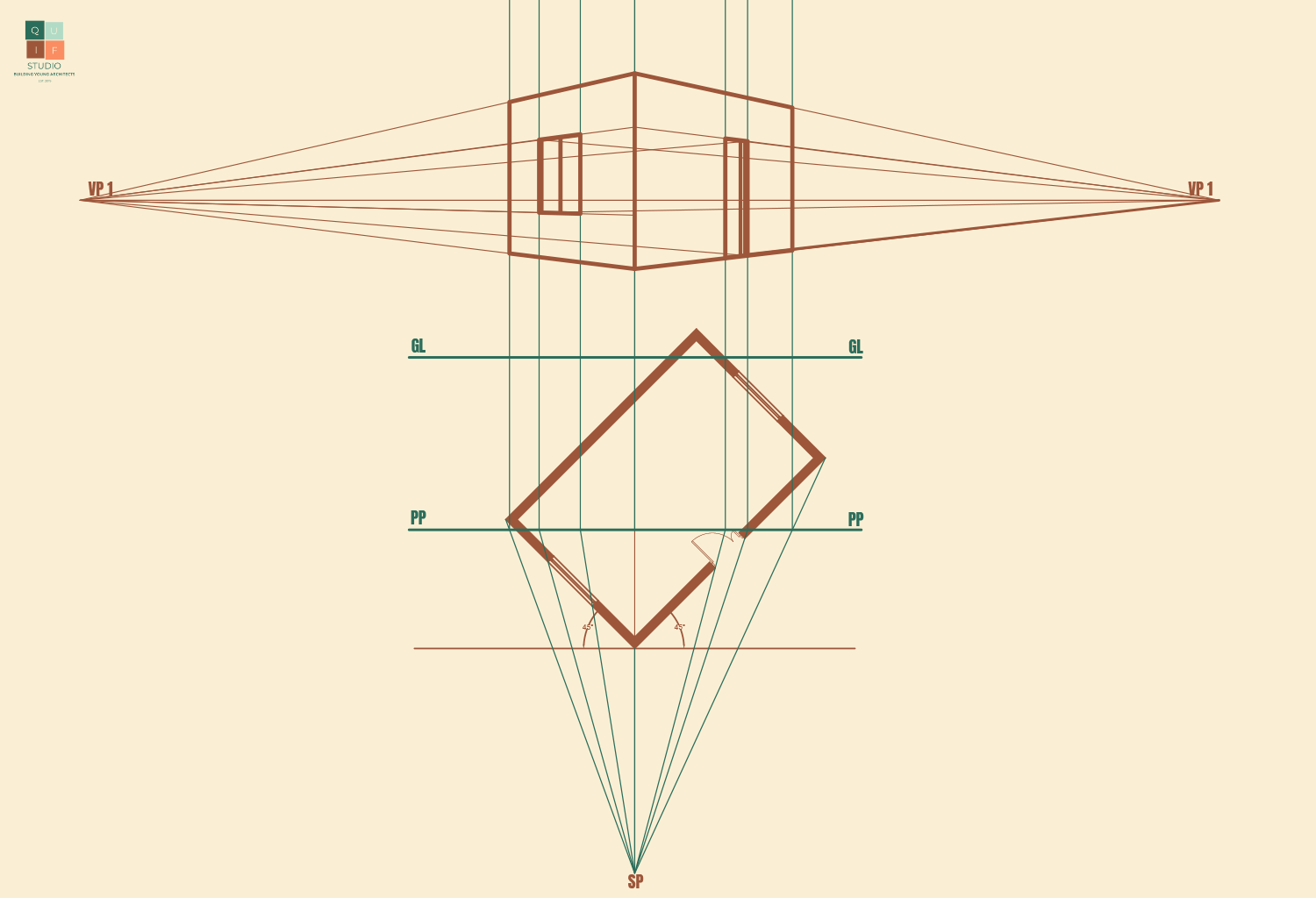
The first step in drawing a perspective from a floor plan is to orient the building to a desired angle of view. The angle we choose will have an effect on how the drawing comes out.
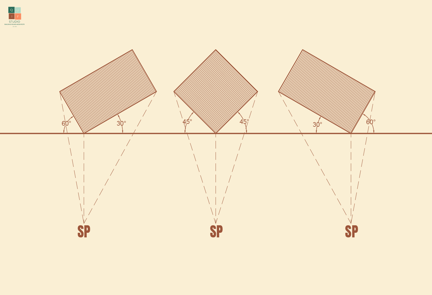
From the diagram above, the second option will reveal both sides of the building evenly for a more pleasant perspective drawing/image. Therefore, we will adopt that angle of view.
We will now place the station point. We will give adequate length away from the building to avoid compressing the perspective image.
We can now choose the position of the picture plane. This will affect the overall size of the perspective image. The closer it is to the station point, the smaller the image. The further it is to the station point, the larger the image. We are going to place the plane not too far away from the station point for a moderate sized image.
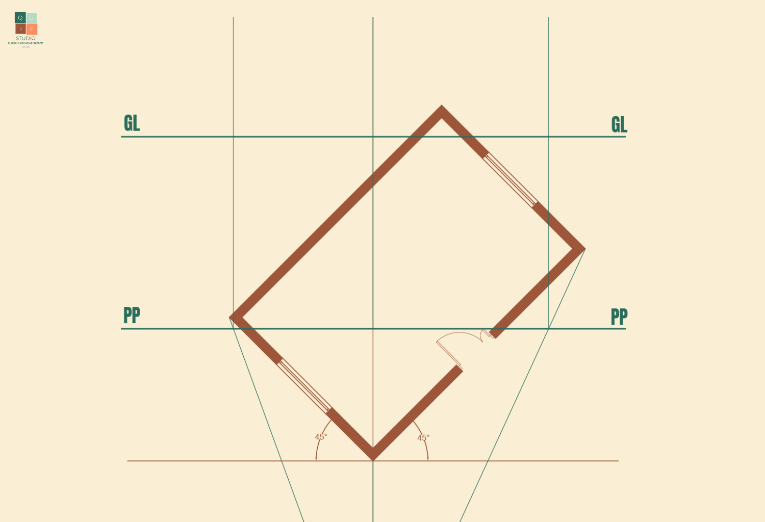
Next, we project lines from the station point to touch the edges of the buildings. These lines should extend and land on the picture plane.

We can now project lines perpendicular to the picture plane from each point where the first projection lines touched the picture plane. We can also introduce a ground line to indicate where the perspective image begins.
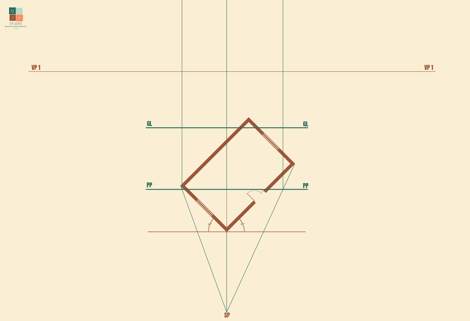
Next, we add in the horizon line and introduce the two vanishing points.
Now, we specify the height of the building along the centre line of view. This will just be a rough estimate. We can then proceed to project lines towards the vanishing points.

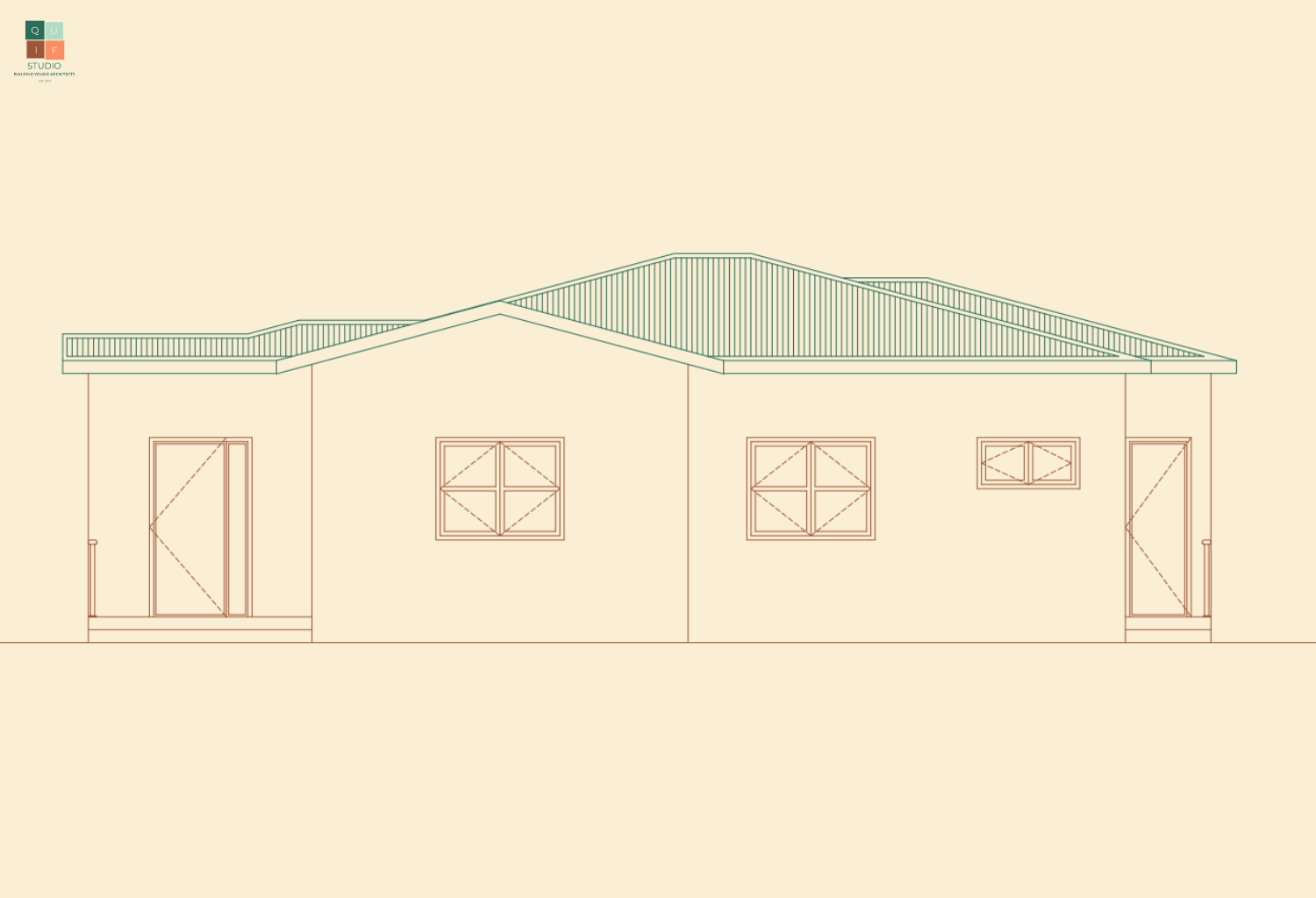
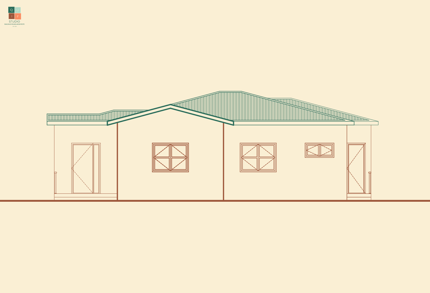
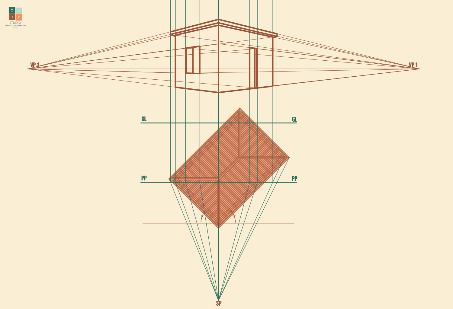
We can begin to generate the perspective image. We are going to identify the connectivity of the walls and add line weight to them.

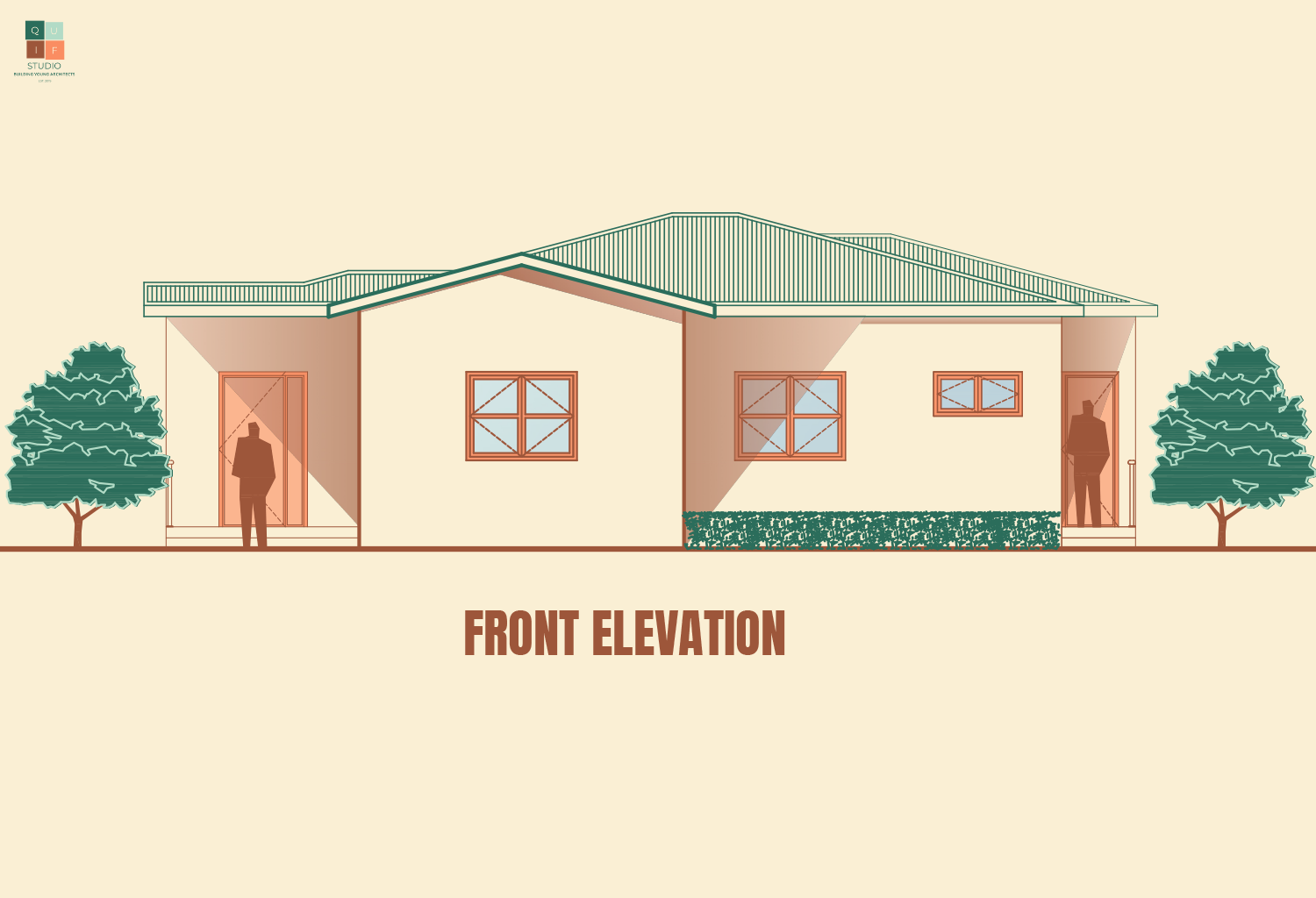
Now add the doors and windows using the same projection style.
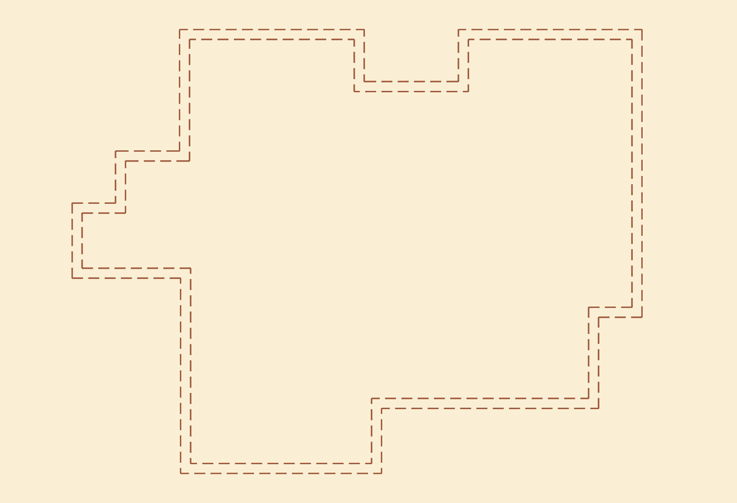
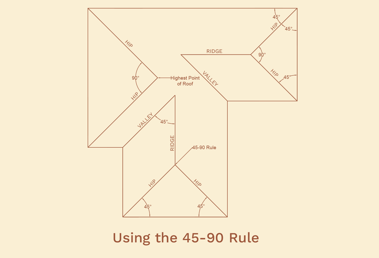
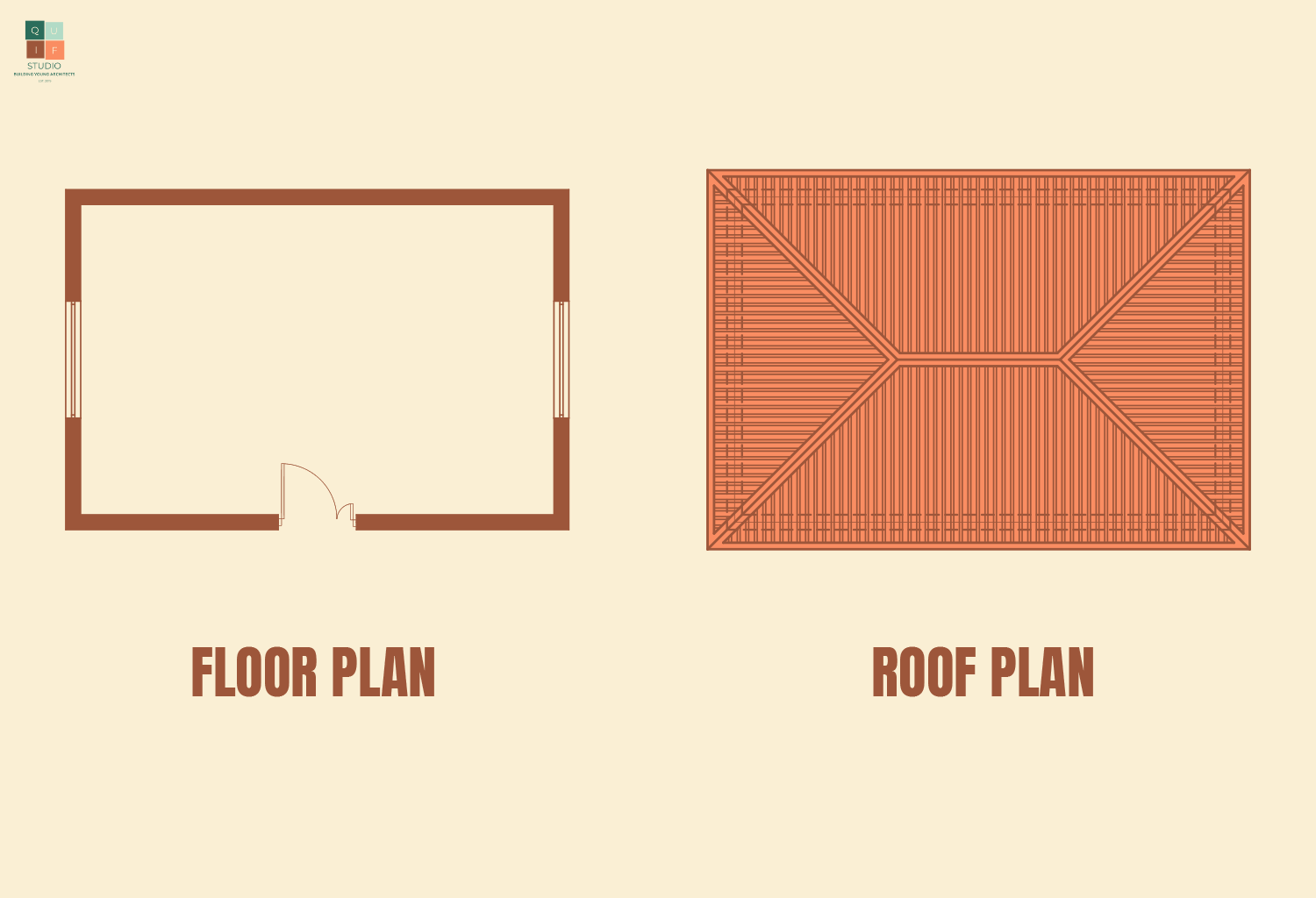
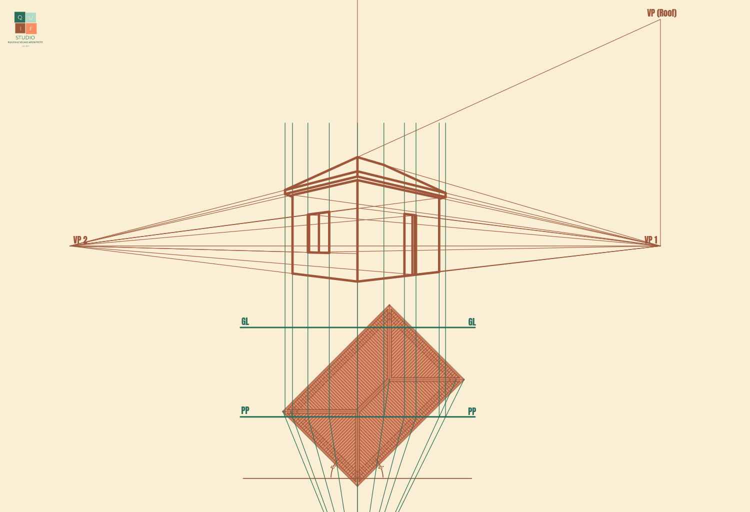
Next, we can project the edges of the roof. To do that, we will need to align the roof plan with the tilted floor plan.
For the roof, we can use the plan to identify where the roof lines will be through projection. However, hip roofs generally have a different vanishing point from the building. This is because lines of roof do not run in a perpendicular or parallel manner, they slope towards various directions.
We will introduce another vanishing point perpendicular to the horizon line, but on the same axis with VP 1. We will use that vanishing point to project the left corner of the roof. The ridge line will project to VP 1 since it has the same properties as the walls (they run on the same axis). We can now connect the other lines of the roof to complete it.
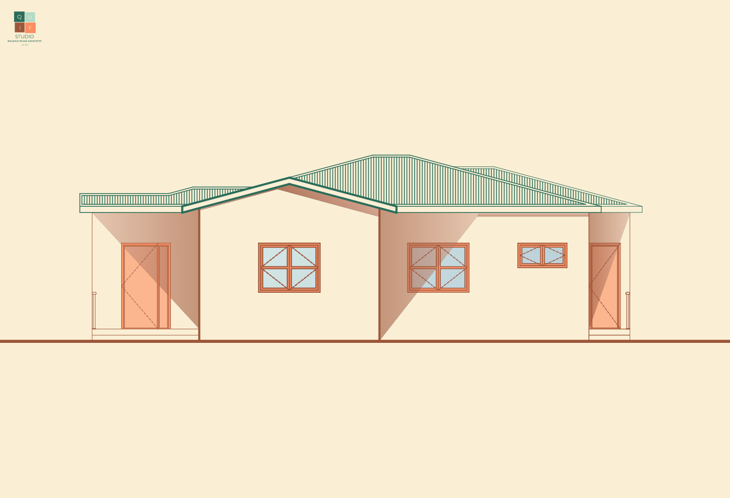
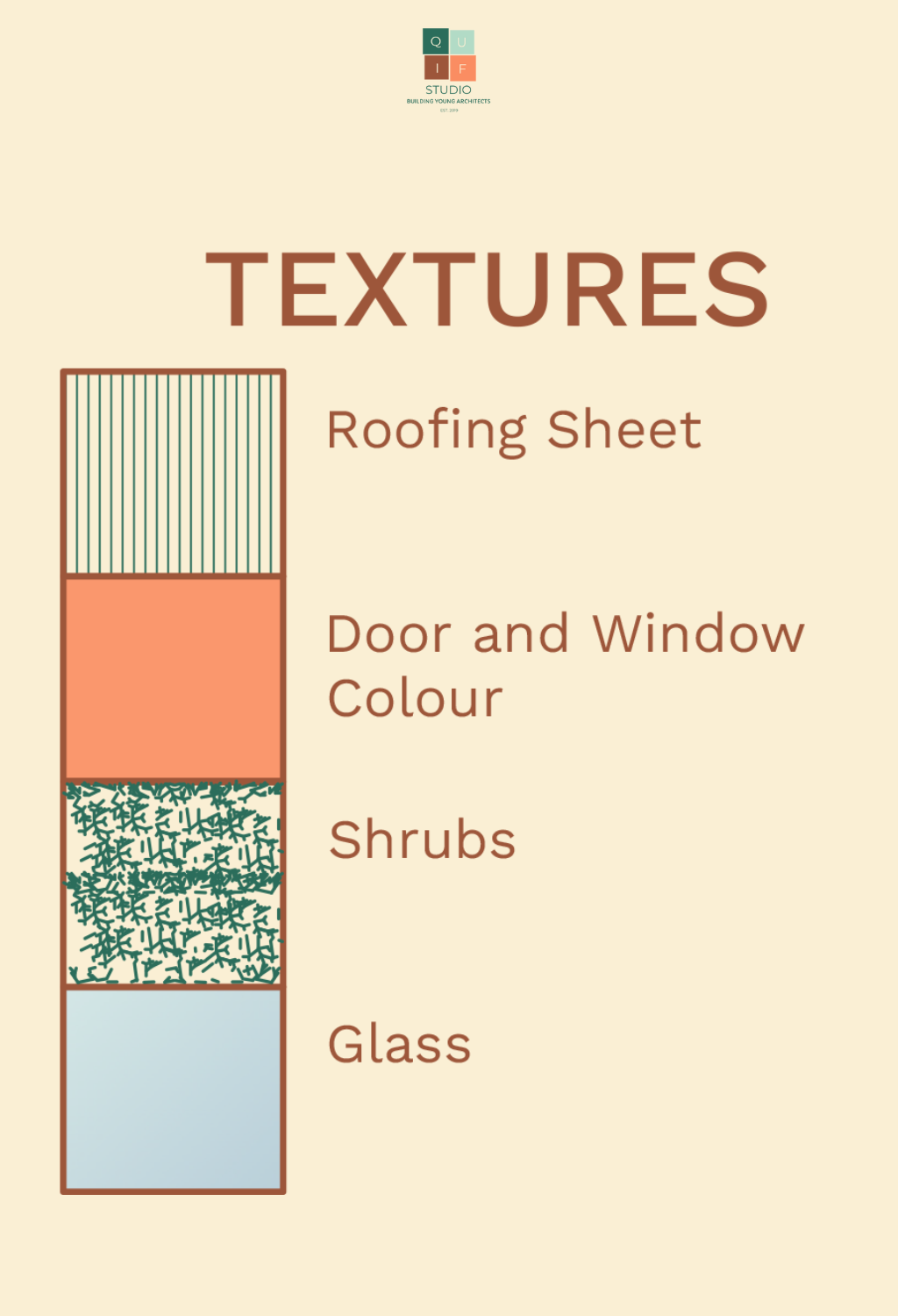
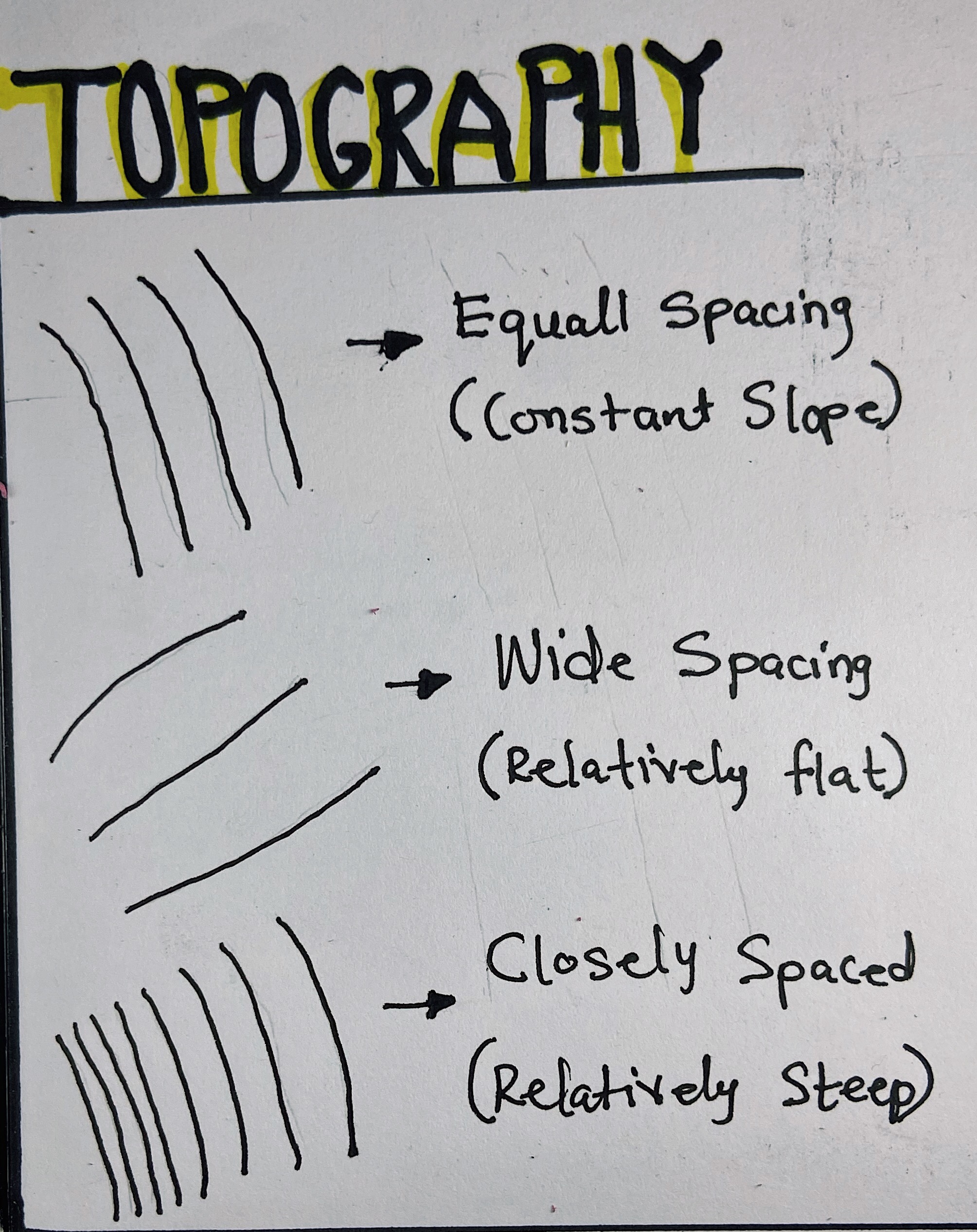
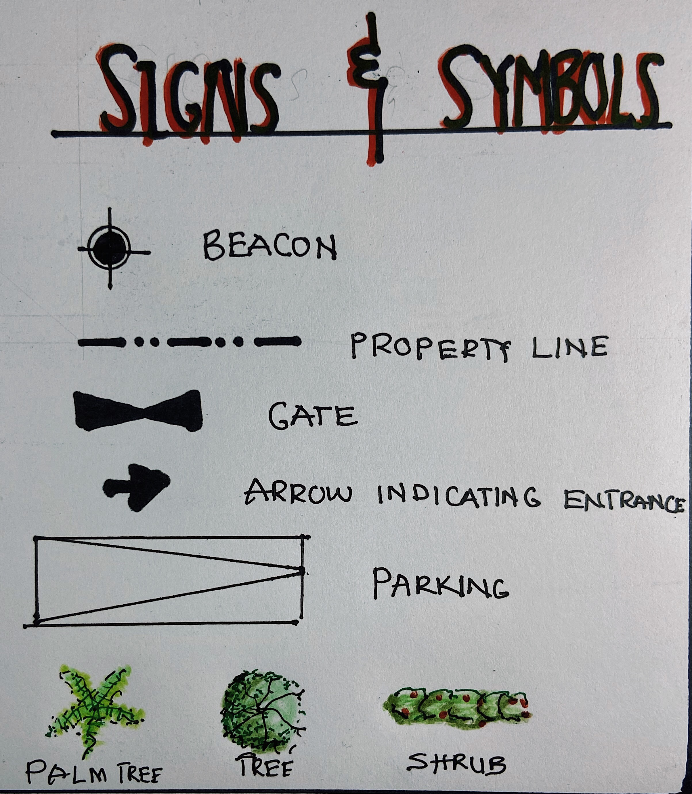
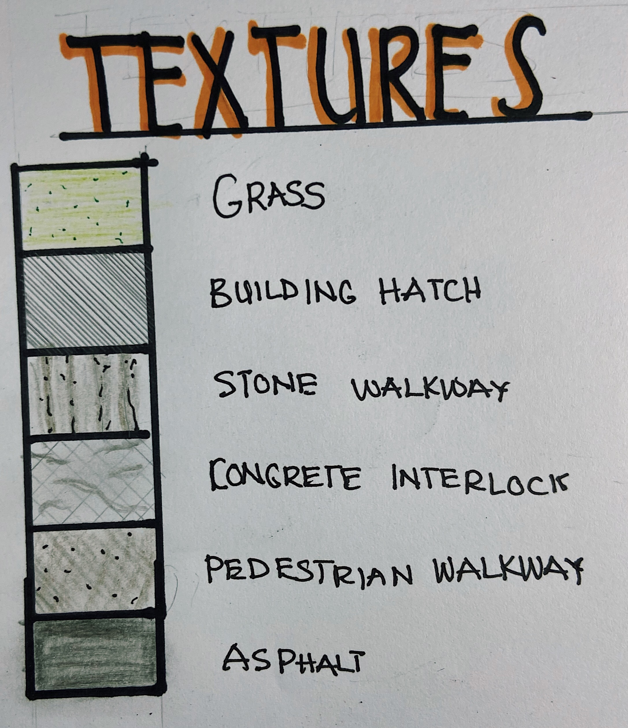
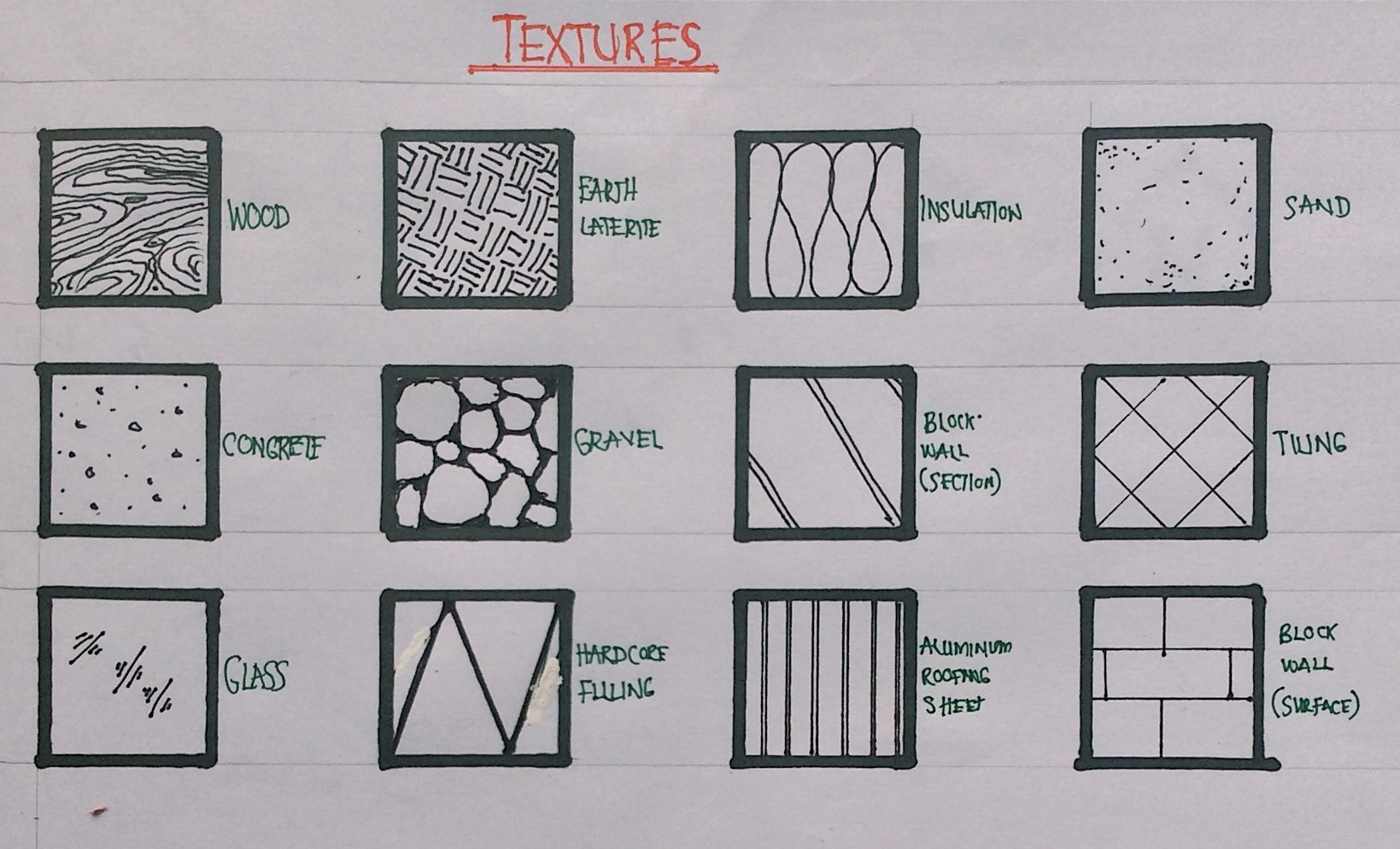
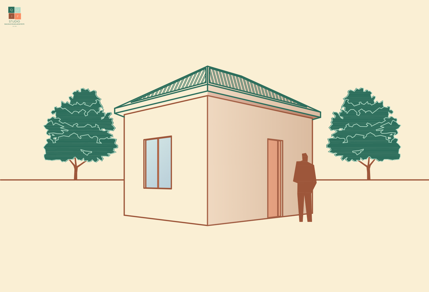
Finally, we can add in finishing details, such as textures, shading, landscaping etc.

As earlier mentioned, drawing perspectives can be tricky. They require constant practice. You can find many tutorials online about how to draw perspectives.
This is the last post in the Architectural Design Series. I hope you learnt the basics of architectural drawings. Feel free to comment and ask questions. Thank you for reading!